The Economist recently released a series of country-level datasets on ‘excess mortality’, a term used to describe ‘the gap between the total number of people who died from any cause, and the historical average for the same place and time of year.’ In simpler terms, the measure captures how many deaths are happening that shouldn’t be.
In the (free!) articles accompanying that data, I came across the following table:
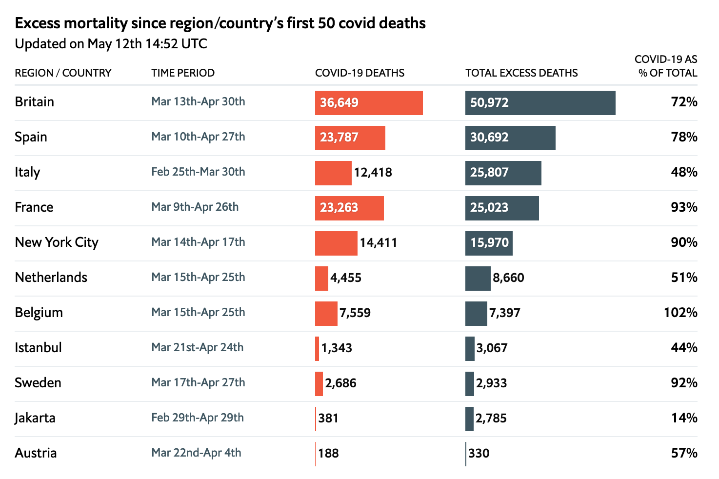
I thought the table was clean and sent a clear message. The addition of inline barcharts is not intrusive but still helps the reader takeaway insights about the data. It’s a rather pretty table. Having recently come across Greg Lin’s package reactable, I thought this could be a good opportunity to try my hand at recreating the above.
(Coincidentally, while I was working on this project, Malcolm Barrett released a similar blog post documenting his recreation of a NYT table using gt. Check it out!)
Loading packages
Our process uses standard packages: reactable (obviously), htmltools as its buddy, lubridate for days and times, hrbrthemes for The Economist’s font, and tidyverse for general purpose data wrangling.
library(reactable)
library(htmltools)
library(lubridate)
library(hrbrthemes)
library(tidyverse)
Gather the data
You can definitely skip this step if you’re not interested in the data collection and cleaning process.
Unfortunately, one of the more time-consuming steps of this project was getting the data in the same format The Economist used in their article. The data they released comes in the form of a series of country-level CSVs; although helpful for country-level analysis, this meant that we have to modify the data into a joined format in order to create a table.
Let’s begin by creating a function which reads in each individual CSV, selects relevant columns, and stores that specific dataframe in the global environment.
create_dataframe <- function(country) {
  ## for URL (below)
  country <- str_replace(country, " ", "_")

  ## read in CSV, given country parameter
  data <-
    readr::read_csv(
      paste0(
        'https://raw.githubusercontent.com/TheEconomist/covid-19-excess-deaths-tracker/master/output-data/excess-deaths/', country, '_excess_deaths.csv'
      )
    )

  ## select relevant columns
  data <- data %>%
    select(
      country,
      region,
      start_date,
      end_date,
      population,
      total_deaths,
      covid_deaths,
      expected_deaths,
      excess_deaths,
      non_covid_deaths
    )

  assign(country, rbind(data), envir = .GlobalEnv)
}
With that function created, we then want to loop it with each country The Economist has included.
To do so, we grab their list of sources from GitHub and pull each country into a list:
country_names <-
  readr::read_csv(
    'https://raw.githubusercontent.com/TheEconomist/covid-19-excess-deaths-tracker/master/source-data/list_of_sources.csv'
  ) %>%
  select(country) %>%
  distinct() %>%
  mutate(country = stringr::str_to_lower(country)) %>%
  filter(country != 'all') %>%
  pull()
Then, we loop!
for (country in country_names) {
  tryCatch({create_dataframe(country)},
           error = function(e) {
             return(NULL)
           })
}
Now, we have a list of dataframes, with each containing one country’s data on excess mortality.
Finally, we merge each of these new dataframes into one master dataset. Here, we are defining in dfs a list of all objects in the global environment that are of the structure data frame. Then, we rbind them all together!
dfs = sapply(.GlobalEnv, is.data.frame)

data <- do.call(rbind, mget(names(dfs)[dfs]))
But unfortunately, that’s not all. We need to filter our data to only include the places that are in The Economist’s table. To make matters more difficult, the table’s identifying row is titled ‘Region/Country’, and includes data from two separate rows in the CSVs.
Let’s begin by manually defining and filtering according to the countries and regions that The Economist includes. (This selection does not seem to have an order to it; as such, it has to be manual).
good_countries <-
  c("Britain",
    "Spain",
    "Italy",
    "France",
    "Netherlands",
    "Belgium",
    "Sweden",
    "Austria")

good_regions <- c("New York City", "Istanbul", "Jakarta")

data_filtered_countries <- data %>%
  filter(country %in% good_countries) %>%
  filter(country == region)
Because the table only has one row for country/region, and groups them accordingly, we can go ahead and replace the country variable in the data_filtered_regions dataframe with region.
data_filtered_regions <- data %>%
  filter(region %in% good_regions) %>%
  # replace for the sake of the table
  mutate(country = region)
And merge:
data_filtered <-
  rbind(data_filtered_countries, data_filtered_regions)
Next, we notice that the table title says ‘Excess mortality since region/country’s first 50 covid deaths.’ This means we need to exclude counts of excess deaths before a region had 50 COVID deaths.
data_filtered <- data_filtered %>%
  group_by(country) %>%
  mutate(csum = cumsum(covid_deaths))
At this point (after only selecting our relevant columns), our data looks like this:
data_filtered %>%
  select(country, start_date, end_date, covid_deaths, excess_deaths, covid_deaths, csum) %>%
  reactable()
We need to group each country according to its total deaths related to COVID-19, and excess deaths. Then, using those two numbers, we calculate the percentage of excess deaths attributable to COVID-19. This can be used as a metric for underreporting of COVID-19 cases in a country.
data_for_table <- data_filtered %>%
  filter(excess_deaths > 0) %>%
  group_by(country) %>%
  summarise(
    excess_deaths = round(sum(excess_deaths)),
    covid_deaths = round(sum(covid_deaths)),
    perc = covid_deaths / excess_deaths
  ) %>%
  select(country, covid_deaths, excess_deaths, perc)

reactable(data_for_table, pagination = FALSE)
The only thing missing at this point is the date range. In order to find and display the dates, we need to find the first date after a given country/region hit 50 COVID-19 cases and the last date in the data for that country/region.
How do we do this? First, we’ll create a function called append_date_suffix which, according to a given day, appends the appropriate suffix.
append_date_suffix <- function(dates) {
  suff <- case_when(
    dates %in% c(11, 12, 13) ~ "th",
    dates %% 10 == 1 ~ 'st',
    dates %% 10 == 2 ~ 'nd',
    dates %% 10 == 3 ~ 'rd',
    TRUE ~ "th"
  )
  paste0(dates, suff)
}
We’ll then group by the country variable and find the min and max date (with the minimum only appearing after a country has seen 50 COVID deaths). Then, we do a lot of formatting of individual days and months, and append them all together with dashes in The Economist’s style. Sorry, there’s a lot going on here.
dates_data <-
  data_filtered %>%
  # only looking at date ranges starting post-50 deaths
  filter(csum > 50) %>%
  group_by(country) %>%
  summarise(start_date = min(start_date),
            end_date = max(end_date)) %>%
  mutate(
    clean_start_day = format(start_date, "%d"),
    clean_start_day = append_date_suffix(as.numeric(clean_start_day)),
    clean_start_month = format(start_date, "%b"),
    clean_end_day = format(end_date, "%d"),
    clean_end_day = append_date_suffix(as.numeric(clean_end_day)),
    clean_end_month = format(end_date, "%b")
  ) %>%
  mutate(
    clean_range = paste0(
      clean_start_month," ", ## Mar
      clean_start_day, "-", ## 6-
      clean_end_month, " ", ## May
      clean_end_day ## 18
    )
  ) %>%
  select(country, clean_range)
This creates date ranges that look like this:
Join these dates with our existing data…
data_for_table <- data_filtered %>%
  filter(excess_deaths > 0) %>%
  group_by(country) %>%
  summarise(
    excess_deaths = round(sum(excess_deaths)),
    covid_deaths = round(sum(covid_deaths)),
    perc = covid_deaths / excess_deaths
  ) %>%
  left_join(dates_data, by = 'country') %>%
  select(country, clean_range, covid_deaths, excess_deaths, perc)
and we get our finalized dataset:
Creating the table
Finally, we’re ready to take that dataset and create our table. We can begin by defining some parameters that make the table easier to use and more aesthetically pleasing. Here, we sort according to excess deaths (but don’t include an arrow), make it compact, and show all results on one page.
reactable(
  data_for_table,
  defaultSortOrder = 'desc',
  defaultSorted = 'excess_deaths',
  showSortIcon = FALSE,
  compact = TRUE,
  pagination = FALSE)
Style headers
Next, let’s make the column headers stylistically similar to The Economist. We do so with reactable’s defaultColDef, where we define a colDef with styles for the header and regular cells. Here, we can include CSS (which you can find by inspecting the table at hand). Throughout this post, you’ll notice my constant references to font_es. This is from Bob Rudis’s hrbrthemes. It contains the font name for Economist Sans Condensed, which is the font that The Economist uses!
reactable(
  data_for_table,
  defaultSortOrder = 'desc',
  defaultSorted = 'excess_deaths',
  showSortIcon = FALSE,
  compact = TRUE,
  pagination = FALSE,
  ######## NEW ########
  defaultColDef = colDef(
    ### define header styling
    headerStyle = list(
      textAlign = "left",
      fontSize = "11px",
      lineHeight = "14px",
      textTransform = "uppercase",
      color = "#0c0c0c",
      fontWeight = "500",
      borderBottom = "2px solid #e9edf0",
      paddingBottom = "3px",
      verticalAlign = "bottom",
      fontFamily = font_es
    ),
    ### define default column styling
    style = list(
      fontFamily = font_es,
      fontSize = "14px",
      verticalAlign = "center",
      align = "left"
    )
  )
)
Format columns
Now, we can start to format the specific columns appropriately. The three easiest columns are Region/Country, Time Period, COVID-19 as % of Total. In each of these columns, we create a colDef which defines the column name, as well as some styling.
You’ll notice the addition of JS in our percent column. This allows us to include JavaScript in our columns and column headers. I use it to do something simple, like a line break. You can use JS for plenty of more complex purposes, some of which are documented here.
reactable(
  data_for_table,
  defaultSortOrder = 'desc',
  defaultSorted = 'excess_deaths',
  showSortIcon = FALSE,
  compact = TRUE,
  pagination = FALSE,
  defaultColDef = colDef(
    headerStyle = list(
      textAlign = "left",
      fontSize = "11px",
      lineHeight = "14px",
      textTransform = "uppercase",
      color = "#0c0c0c",
      fontWeight = "500",
      borderBottom = "2px solid #e9edf0",
      paddingBottom = "3px",
      verticalAlign = "bottom",
      fontFamily = font_es
    ),
    style = list(
      fontFamily = font_es,
      fontSize = "14px",
      verticalAlign = "center",
      align = "left"
    )
  ),
  ####### NEW #######
  columns = list(
    country = colDef(
      name = "Region / Country",
      style = list(fontFamily = font_es,
                   fontWeight = "400")
    ),
    perc = colDef(
      html = TRUE,
      header = JS("
      function(colInfo) {
        return 'COVID-19 as<br>% of total'
      }"),
      name = "COVID-19 as % of Total",
      align = "right",
      maxWidth = 100,
      format = colFormat(percent = TRUE, digits = 0),
      style = list(fontFamily =  font_es_bold),
      headerStyle = list(
        fontSize = "11px",
        lineHeight = "14px",
        textTransform = "uppercase",
        color = "#0c0c0c",
        fontWeight = "500",
        borderBottom = "2px solid #e9edf0",
        paddingBottom = "3px",
        verticalAlign = "bottom",
        fontFamily = font_es,
        textAlign = "right"
      )
    ),
    clean_range = colDef(
      name = "Time Period",
      style = list(
        color = '#3f5661',
        fontSize = '12px',
        fontFamily = font_es
      )
    )
  )
)
Add the barcharts
We can now create the ‘deaths’ columns, which include barcharts.
reactable makes the addition of barcharts to tables quite easy, thanks to its integration of JavaScript. Here, I pull from one example on reactable’s website, and use the following code:
reactable(
  data_for_table,
  defaultSortOrder = 'desc',
  defaultSorted = 'excess_deaths',
  showSortIcon = FALSE,
  compact = TRUE,
  pagination = FALSE,
  defaultColDef = colDef(
    headerStyle = list(
      textAlign = "left",
      fontSize = "11px",
      lineHeight = "14px",
      textTransform = "uppercase",
      color = "#0c0c0c",
      fontWeight = "500",
      borderBottom = "2px solid #e9edf0",
      paddingBottom = "3px",
      verticalAlign = "bottom",
      fontFamily = font_es
    ),
    style = list(
      fontFamily = font_es,
      fontSize = "14px",
      verticalAlign = "center",
      align = "left"
    )
  ),
  columns = list(
    country = colDef(
      name = "Region / Country",
      style = list(fontFamily = font_es,
                   fontWeight = "400")
    ),
    perc = colDef(
      html = TRUE,
      header = JS("
      function(colInfo) {
        return 'COVID-19 as<br>% of total'
      }"),
      name = "COVID-19 as % of Total",
      align = "right",
      maxWidth = 100,
      format = colFormat(percent = TRUE, digits = 0),
      style = list(fontFamily =  font_es_bold),
      headerStyle = list(
        fontSize = "11px",
        lineHeight = "14px",
        textTransform = "uppercase",
        color = "#0c0c0c",
        fontWeight = "500",
        borderBottom = "2px solid #e9edf0",
        paddingBottom = "3px",
        verticalAlign = "bottom",
        fontFamily = font_es,
        textAlign = "right"
      )
    ),
    clean_range = colDef(
      name = "Time Period",
      style = list(
        color = '#3f5661',
        fontSize = '12px',
        fontFamily = font_es
      )
    ),
    ###### NEW ######
    covid_deaths = colDef(
      name = "COVID-19 Deaths",
      cell = function(value) {
        width <- paste0(value * 100 / max(data_for_table$covid_deaths), "%")
        value <- format(value, big.mark = ",")
        value <- format(value, width = 10, justify = "right")
        bar <- div(
          class = "bar-chart",
          style = list(marginRight = "6px"),
          div(
            class = "bar",
            style = list(width = width, backgroundColor = "#F15A3F")
          )
        )
        div(class = "bar-cell", span(class = "number", value), bar)
      }
    ),
    excess_deaths = colDef(
      name = "Total Excess Deaths",
      cell = function(value) {
        width <-
          paste0(value * 100 / max(data_for_table$excess_deaths), "%")
        value <- format(value, big.mark = ",")
        value <- format(value, width = 10, justify = "right")
        bar <- div(
          class = "bar-chart",
          style = list(marginRight = "6px"),
          div(
            class = "bar",
            style = list(width = width, backgroundColor = "#3F5661")
          )
        )
        div(class = "bar-cell", span(class = "number", value), bar)
      }
    )
  )
)
Let’s break that down step-by-step, with a focus on covid_deaths.
First, we need to define some CSS. reactable allows you to easily include CSS is RMarkdown documents, in chunks defined as css.
.bar-cell {
  display: flex;
  align-items: center;
}

.number {
  font-size: 13.5px;
  white-space: pre;
}

.bar-chart {
  flex-grow: 1;
  margin-left: 6px;
  height: 22px;
}

.bar {
  height: 100%;
}
Now, let’s look at how we define covid_deaths:
  covid_deaths = colDef(
    ### define the name
    name = "COVID-19 Deaths",
    ### create a 'cell' function
    cell = function(value) {
      ### define the bar width according to the specified value
      width <- paste0(value * 100 / max(data_for_table$covid_deaths), "%")
      ### add a comma to the label
      value <- format(value, big.mark = ",")
      ### justify and provide padding with width
      value <- format(value, width = 10, justify = "right")
      ### create the barchart div
      bar <- div(
        ### with a class of 'bar-chart'
        class = "bar-chart",
        ### give the bar a margin
        style = list(marginRight = "6px"),
        ### create the *actual* bar, with the red economist color
        div(
          class = "bar",
          style = list(width = width, backgroundColor = "#F15A3F")
        )
      )
      ### bring it all together, with the 'value' (number) preceding the bar itself
      div(class = "bar-cell", span(class = "number", value), bar)
    }
  )
This creates a table that looks like this:
Add a title
Finally, we can add the table title and subtitle. We do so by storing the above table in our environment. (This is the final table code!)
table <- reactable(
  data_for_table,
  defaultSortOrder = 'desc',
  defaultSorted = 'excess_deaths',
  showSortIcon = FALSE,
  compact = TRUE,
  pagination = FALSE,
  defaultColDef = colDef(
    headerStyle = list(
      textAlign = "left",
      fontSize = "11px",
      lineHeight = "14px",
      textTransform = "uppercase",
      color = "#0c0c0c",
      fontWeight = "500",
      borderBottom = "2px solid #e9edf0",
      paddingBottom = "3px",
      verticalAlign = "bottom",
      fontFamily = font_es
    ),
    style = list(
      fontFamily = font_es,
      fontSize = "14px",
      verticalAlign = "center",
      align = "left"
    )
  ),

  columns = list(
    country = colDef(
      name = "Region / Country",
      style = list(fontFamily = font_es,
                   fontWeight = "400")
    ),
    covid_deaths = colDef(
      name = "COVID-19 Deaths",
      # align = "left",
      cell = function(value) {
        width <- paste0(value * 100 / max(data_for_table$covid_deaths), "%")
        value <- format(value, big.mark = ",")
        # value <- str_pad(value, 6, pad = "")
        value <- format(value, width = 10, justify = "right")
        bar <- div(
          class = "bar-chart",
          style = list(marginRight = "6px"),
          div(
            class = "bar",
            style = list(width = width, backgroundColor = "#F15A3F")
          )
        )
        div(class = "bar-cell", span(class = "number", value), bar)
      }
    ),
    excess_deaths = colDef(
      name = "Total Excess Deaths",
      # align = "left",
      cell = function(value) {
        width <-
          paste0(value * 100 / max(data_for_table$excess_deaths), "%")
        value <- format(value, big.mark = ",")
        value <- format(value, width = 10, justify = "right")
        bar <- div(
          class = "bar-chart",
          style = list(marginRight = "6px"),
          div(
            class = "bar",
            style = list(width = width, backgroundColor = "#3F5661")
          )
        )
        div(class = "bar-cell", span(class = "number", value), bar)
      }
    ),
    perc = colDef(
      html = TRUE,
      header = JS("
      function(colInfo) {
        return 'COVID-19 as<br>% of total'
      }"),
      name = "COVID-19 as % of Total",
      align = "right",
      maxWidth = 100,
      format = colFormat(percent = TRUE, digits = 0),
      style = list(fontFamily =  font_es_bold),
      headerStyle = list(
        fontSize = "11px",
        lineHeight = "14px",
        textTransform = "uppercase",
        color = "#0c0c0c",
        fontWeight = "500",
        borderBottom = "2px solid #e9edf0",
        paddingBottom = "3px",
        verticalAlign = "bottom",
        fontFamily = font_es,
        textAlign = "right"
      )
    ),
    clean_range = colDef(
      name = "Time Period",
      style = list(
        color = '#3f5661',
        fontSize = '12px',
        fontFamily = font_es
      )
    )
  ),
)
Now, we can include a title and subtitle above the table. We use some htmltools functions to create divs, headers, and paragraphs.
div(
    div(
      h2("Excess mortality since region/country’s first 50 covid deaths"),
      p(
        ### create the 'Updated on ...' and make it dynamic
        paste0(
          "Updated on ", format(Sys.Date(), "%B "),
          append_date_suffix(as.numeric(format(Sys.Date(), "%d"))), " ",
          strftime(Sys.time(), format = "%H:%M"), " UCT"
        )
      ),
    ),
    table)
Excess mortality since region/country’s first 50 covid deaths
Updated on January 25th 07:50 UCT
Yikes! Those font sizes don’t quite line up with The Economist’s. Let’s add classes to our divs to match their style.
.table {
  margin: 0 auto;
  width: 675px;
}

.tableTitle {
  margin: 6px 0;
  font-size: 16px;
  font-family: 'Econ Sans Cnd'
}

.tableTitle h2 {
  font-size: 16px;
  font-weight: bold;
  font-family: 'Econ Sans Cnd'
}

.tableTitle p {
  font-size: 14px;
  font-weight: 500;
}
div(class = "tableTitle",
div(
class = "title",
h2("Excess mortality since region/country’s first 50 covid deaths"),
p(
paste0("Updated on ", format(Sys.Date(),"%B "),
append_date_suffix(as.numeric(format(Sys.Date(), "%d"))), " ",
strftime(Sys.time(), format = "%H:%M"), " UCT"
)
),
),
table)Excess mortality since region/country’s first 50 covid deaths
Updated on January 25th 07:50 UCT
Let’s compare that to the table we’re attempting to replicate. Note that some of the data has changed in the time between The Economist published their table and I created mine.
Connor Rothschild
Undergraduate at Rice University
I’m a senior at Rice University interested in public policy, data science and their intersection. I’m most passionate about translating complex data into informative and entertaining visualizations.