How to Combine Animated Plots in R
Leveraging the power of {gganimate} and {magick} to combine animated plots for your viewers.
October 2019 • 9 minute read
In this tutorial, I'm going to outline the steps necessary to create an animated, faceted plot in R. Although rare, combining animated plots can be a powerful way to showcase different elements of the same data (as you'll see below).
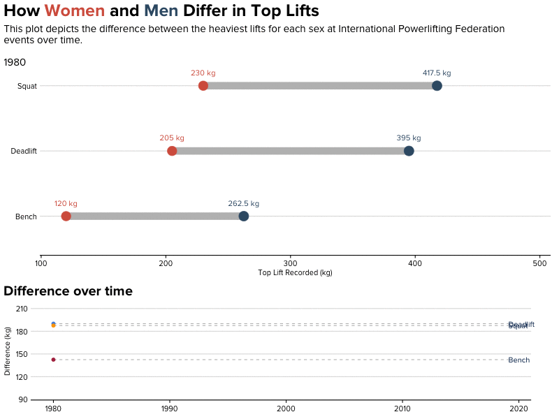
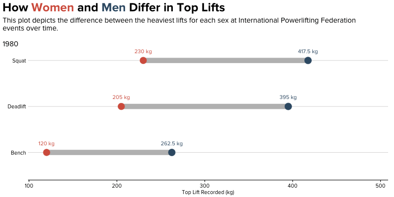
In this example, I'm using weightlifting data from the International Powerlifting Federation. For the purposes of this tutorial, we'll look at differences in top lifts by sex. A faceted, animated plot is a great option because we'd like to observe the magnitude of these differences and how these differences have evolved over time.
We'll be creating this GIF:
Environment Setup
These are the packages we'll need to get started. In my case, I use a custom theme I've developed for stylistic purposes. Feel free to instead run theme_set(theme_minimal()) rather than use my theme!
library(ggplot2)
library(tidyverse)
library(ggtext)
library(gifski)
library(gganimate)
library(cr)

set_cr_theme(font = "Proxima Nova")
# theme_set(theme_minimal())
Load and Clean Data
I've already done a lot of the data cleaning for you. If you'd like to follow along, here's the process (or, skip ahead!).
Here, we'll do some minor cleaning and then reshape the three lifts into one column:
ipf_lifts <- readr::read_csv("data/ipf_lifts.csv") %>%
  mutate(year = lubridate::year(date))

ipf_lifts_reshape <- ipf_lifts %>%
  tidyr::pivot_longer(cols = c("best3squat_kg", "best3bench_kg", "best3deadlift_kg"), names_to = "lift") %>%
  select(name, sex, year, lift, value)
For my visualization, I’m only concerned with the heaviest lifts from each year:
ipf_lifts_maxes <- ipf_lifts_reshape %>%
  group_by(year, sex, lift) %>%
  top_n(1, value) %>%
  ungroup %>%
  distinct(year, lift, value, .keep_all = TRUE)
The first visualization we'll create for the final output is a dumbbell plot. Curious what that is, or how to make it in R? Check out my other post on the topic.
In order to construct a dumbbell plot, we need both male and female
observations in the same row. For this, we use the spread function.
max_pivot <- ipf_lifts_maxes %>%
  spread(sex, value)
Now, let’s construct a dataframe for each sex:
male_lifts <- max_pivot %>%
  select(-name) %>%
  filter(!is.na(M)) %>%
  group_by(year, lift) %>%
  summarise(male = mean(M))

female_lifts <- max_pivot %>%
  select(-name) %>%
  filter(!is.na(F)) %>%
  group_by(year, lift) %>%
  summarise(female = mean(F))
And join them:
max_lifts <- merge(male_lifts, female_lifts)

max_lifts_final <- max_lifts %>%
  group_by(year, lift) %>%
  mutate(diff = male - female)
Not following along, or want to check your progress? Here's what our data looks like in its final form:
| year | lift | male | female | diff |
|---|---|---|---|---|
| 1980 | best3bench_kg | 262.5 | 120 | 142.5 |
| 1980 | best3deadlift_kg | 395 | 205 | 190 |
| 1980 | best3squat_kg | 417.5 | 230 | 187.5 |
| 1981 | best3bench_kg | 245 | 150 | 95 |
| 1981 | best3deadlift_kg | 367.5 | 230 | 137.5 |
| 1981 | best3squat_kg | 427.5 | 215 | 212.5 |
Visualize!
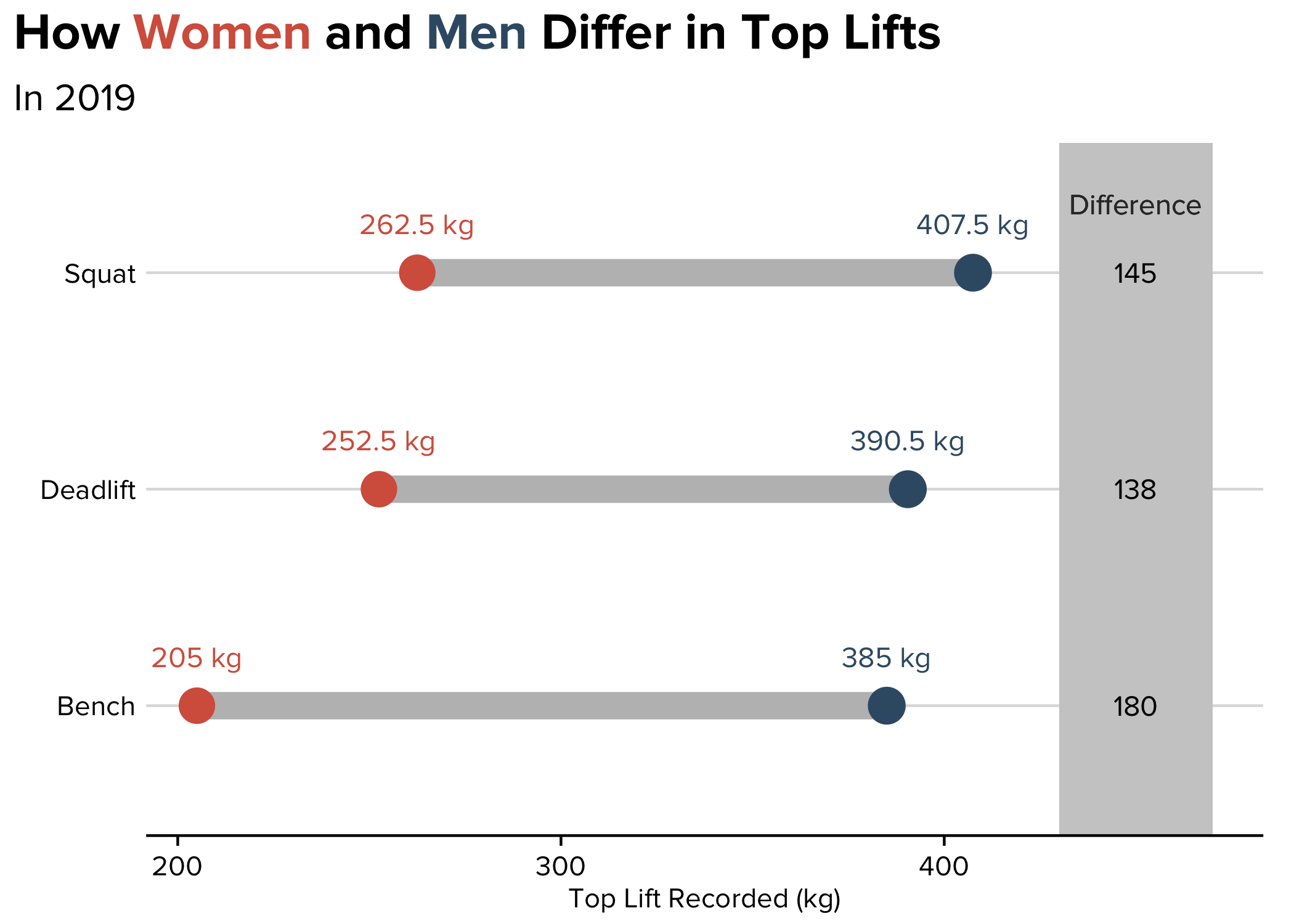
Finally, we can construct the visualization.
First, we can create a static visualization using ggalt (again, my blog post covers the details of this step).
You can fast forward the creation of individual plots if you're only interested in the combination of the two. You'll find that at the end of this post!
max_lifts_final %>%
  filter(year == 2019) %>%
  ggplot() +
  ggalt::geom_dumbbell(aes(y = lift,
                    x = female, xend = male),
                colour = "grey", size = 5,
                colour_x = "#D6604C", colour_xend = "#395B74") +
  labs(y = element_blank(),
       x = "Top Lift Recorded (kg)",
       title =  "How <span style='color:#D6604C'>Women</span> and <span style='color:#395B74'>Men</span> Differ in Top Lifts",
                       subtitle = "In 2019") +
  theme(plot.title = element_markdown(lineheight = 1.1, size = 20),
        plot.subtitle = element_text(size = 15)) +
  scale_y_discrete(labels = c("Bench", "Deadlift", "Squat")) +
  drop_axis(axis = "y") +
  geom_text(aes(x = female, y = lift, label = paste(female, "kg")),
            color = "#D6604C", size = 4, vjust = -2) +
  geom_text(aes(x = male, y = lift, label = paste(male, "kg")),
            color = "#395B74", size = 4, vjust = -2) +
  geom_rect(aes(xmin=430, xmax=470, ymin=-Inf, ymax=Inf), fill="grey80") +
  geom_text(aes(label=diff, y=lift, x=450), size=4) +
  geom_text(aes(x=450, y=3, label="Difference"),
            color="grey20", size=4, vjust=-3)
Finally, we animate, using Thomas Pedersen’s wonderful gganimate
package. This is a relatively easy step, because gganimate only requires two extra lines of code: transition_states and ease_aes. Then, we pass it into the animate function!
animation <- max_lifts_final %>%
  ggplot() +
  ggalt::geom_dumbbell(aes(y = lift,
                    x = female, xend = male),
                colour = "grey", size = 5,
                colour_x = "#D6604C", colour_xend = "#395B74") +
  labs(y = element_blank(),
       x = "Top Lift Recorded (kg)",
       title =  "How <span style='color:#D6604C'>Women</span> and <span style='color:#395B74'>Men</span> Differ in Top Lifts",
  subtitle='\nThis plot depicts the difference between the heaviest lifts for each sex at International Powerlifting Federation\nevents over time. \n \n{closest_state}') +
  theme(plot.title = element_markdown(lineheight = 1.1, size = 25, margin=margin(0,0,0,0)),
        plot.subtitle = element_text(size = 15, margin=margin(8,0,-30,0))) +
  scale_y_discrete(labels = c("Bench", "Deadlift", "Squat")) +
  drop_axis(axis = "y") +
  geom_text(aes(x = female, y = lift, label = paste(female, "kg")),
            color = "#D6604C", size = 4, vjust = -2) +
  geom_text(aes(x = male, y = lift, label = paste(male, "kg")),
            color = "#395B74", size = 4, vjust = -2) +
  transition_states(year, transition_length = 4, state_length = 1) +
  ease_aes('cubic-in-out')

a_gif <- animate(animation,
                 fps = 10,
                 duration = 25,
                 width = 800, height = 400,
                 renderer = gifski_renderer("outputs/animation.gif"))

a_gif
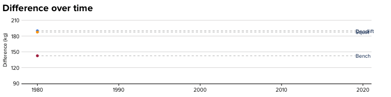
But in our case, we'd like to include another GIF: a line chart of differences over time.
animation2 <- max_lifts_final %>%
  ungroup %>%
  mutate(lift = case_when(lift == "best3bench_kg" ~ "Bench",
                          lift == "best3squat_kg" ~ "Squat",
                          lift == "best3deadlift_kg" ~ "Deadlift")) %>%
  ggplot(aes(year, diff, group = lift, color = lift)) +
  geom_line(show.legend = FALSE) +
  geom_segment(aes(xend = 2019.1, yend = diff), linetype = 2, colour = 'grey', show.legend = FALSE) +
  geom_point(size = 2, show.legend = FALSE) +
  geom_text(aes(x = 2019.1, label = lift, color = "#000000"), hjust = 0, show.legend = FALSE) +
  drop_axis(axis = "y") +
  transition_reveal(year) +
  coord_cartesian(clip = 'off') +
  theme(plot.title = element_text(size = 20)) +
  labs(title = 'Difference over time',
       y = 'Difference (kg)',
       x = element_blank()) +
  theme(plot.margin = margin(5.5, 40, 5.5, 5.5))

b_gif <- animate(animation2,
                 fps = 10,
                 duration = 25,
        width = 800, height = 200,
        renderer = gifski_renderer("outputs/animation2.gif"))

b_gif
Finally, we'll combine them using magick (thanks to this
post):
library(magick)
a_mgif <- image_read(a_gif)
b_mgif <- image_read(b_gif)

new_gif <- image_append(c(a_mgif[1], b_mgif[1]), stack = TRUE)
for(i in 2:250){
  combined <- image_append(c(a_mgif[i], b_mgif[i]), stack = TRUE)
  new_gif <- c(new_gif, combined)
}
What’s happening here? Essentially, we’re using the power of magick to:
- Read in all of the individual images (
image_read) from each GIF (after all, a GIF is just a series of images!). - For the first frame, stack the two images on top of each other (
image_append), so plot 1 is above plot 2. - For the rest of the frames (in my case, the next 249, because my GIF had 250 frames), replicate this and combine it with the first frame (this is the
forloop).
Here, we specify stack = TRUE so that one plot is above the other. If you'd like to place them side-by-side, specify stack = FALSE.
In combination, the process results in our final output:
In this view, we can see the magnitude of the differences both relatively and absolutely (top chart), and we can see how these differences change over time (bottom chart). The power of an animated, combined chart!