My First Package! Introducing 'tpltheme'
I’ve spent the majority of the summer as an intern with the Texas Policy Lab, working on primarily data science-related matters such as data cleaning and visualization. Most recently, I sought to create a custom theme in ggplot2 for TPL.
The project was my first experience in developing my own R package. Prior to this project, the most familiarity I had with packages were from the install.packages() and library() commands.
Hadley Wickham’s book R Packages was enormously helpful in introducing package development to me. I ran into (a lot of) issues in building the package, specifically encountering problems related to local file paths and logo placement on plots.
Creating your own package is a great exercise in trial and error, and taught me a lot about programming in R that I wouldn’t have learned otherwise. I was also struck by how remarkably easy it was to create one’s own package (seriously, it requires the same amount of clicks as starting a new R project), and how thorough online resources were.
Inspiration
The catalyst for creating this package was coming across the Urban Institute’s urbnthemes package on GitHub. I also gathered a lot of inspiration (and borrowed some code) from ggthemes (Jeffrey Arnold), bbplot (BBC News), and hrbrthemes (Bob Rudis). I was impressed by the fact that these organizations were able to use R to create publication-ready plots despite the fact that base ggplot figures can look rather ugly (if we’re being honest).
Because the organization I intern with is still in its infancy, I thought it would be a perfect time to create a standardized theme for figures made in the future. So long as future employees adopt the theme, this package has the potential to create figures specific to our publications, lending TPL organizational credibility and creating cross-report consistency.
I thought a lot about some basic tenets of design, such as font readability, text size, and color contrast. I learned a lot about visual and aesthetic design I wouldn’t know otherwise (Kieran Healy’s section on how graphs can deceive the reader–intentionally or not–opened my eyes to a lot of important visual concepts.
Overview
Here’s an overview of some of the packages key features:
Installation and Usage
You can install the package via GitHub:
library(ggplot2)
library(tidyverse)

#devtools::install_github("connorrothschild/tpltheme")
library(tpltheme)
Always load library(tpltheme) after library(ggplot2) and/or library(tidyverse).
The package creates a standardized formats for plots to be used in reports created by the Texas Policy Lab. It primarily relies on set_tpl_theme(), which allows the user to specify whether the plot theme should align with a standard plot (style = "print"), or one specially created for plotting geographical data (style = "Texas"). Calling set_tpl_theme() after library(tpltheme) does most of the work for this package!
set_tpl_theme()

ggplot(iris, aes(x=Species, y=Sepal.Width, fill=Species)) +
    geom_bar(stat="summary", fun.y="mean", show.legend = FALSE) +
    scale_y_continuous(expand = expand_scale(mult = c(0, 0.001))) +
    labs(x="Species", y="Mean Sepal Width (cm)", fill="Species", title="Iris Dataset")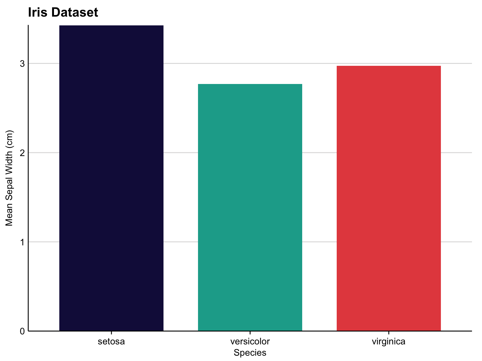
Fonts
The user is able to specify whether they want to use Lato or Adobe Caslon Pro in their figures.
To ensure that these fonts are installed and registered, use tpl_font_test(). If fonts are not properly installed, install both fonts online and then run tpl_font_install().
tpl_font_test()
tpl_font_install()
Here are some examples of sample TPL plots with different specifications for style and font.
set_tpl_theme(style = "print", font = "lato")

ggplot(iris, aes(x=jitter(Sepal.Width), y=jitter(Sepal.Length), col=Species, size = Petal.Length)) +
    geom_point() +
    labs(x="Sepal Width (cm)", y="Sepal Length (cm)", col="Species", size = "Petal Length", title="Iris Dataset")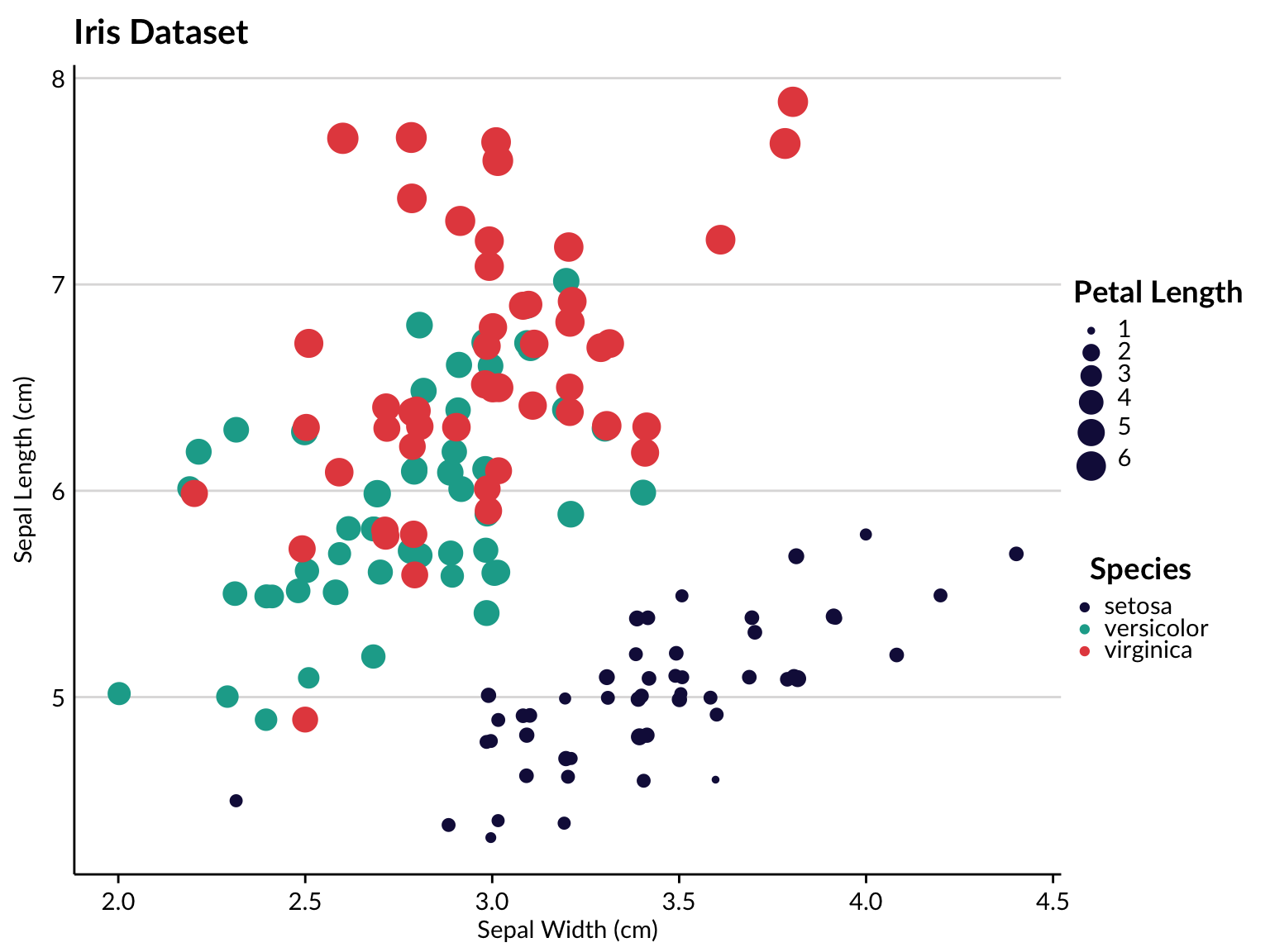
By specifying style = "Texas" within set_tpl_theme, the user may also create Texas-specific plots.
tx_vac <- readr::read_csv("https://raw.githubusercontent.com/connorrothschild/tpltheme/master/data/tx_vac_example.csv")
set_tpl_theme(style = "Texas", font = "adobe")

ggplot(data = tx_vac, mapping = aes(x = long, y = lat, group = group, fill = avgvac*100)) +
  coord_fixed(1.3) +
  scale_fill_continuous(limits = c(78.3,100)) +
  geom_polygon(color = "black") +
  labs(title = "Texas Vaccination Rate by County",
       subtitle = "Among Kindergarteners",
       fill = "Percent\nVaccinated",
       caption = "Source: Texas DSHS")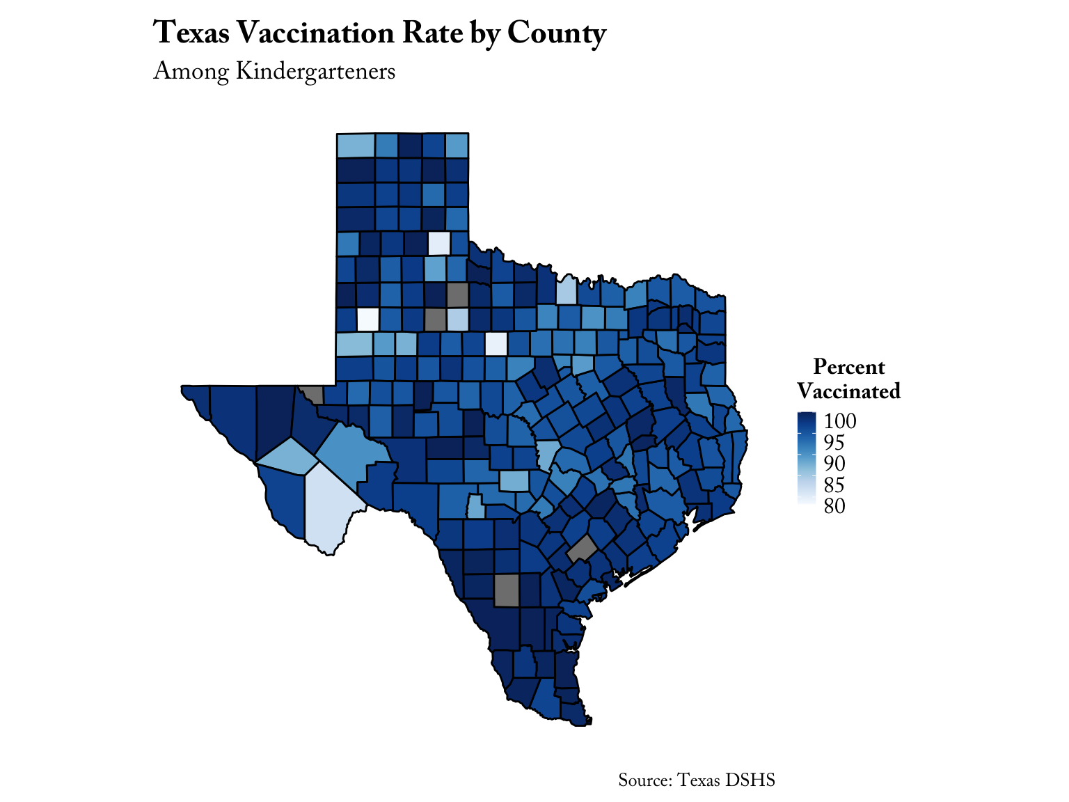
And it also works for categorical variables:
set_tpl_theme(style = "Texas", font = "lato")

tx_vac %>%
  dplyr::mutate(cat = factor(dplyr::case_when(avgvac*100 > 99 ~ "Great",
                         avgvac*100 > 90 ~ "Average",
                         avgvac*100 < 90 ~ "Bad"))) %>%
  ggplot(mapping = aes(x = long, y = lat, group = group, fill = cat)) +
  coord_fixed(1.3) +
  geom_polygon(color = "black") +
  labs(title = "Texas Vaccination Rate by County",
       subtitle = "Among Kindergarteners",
       fill = "Vaccination Rating",
       caption = "Source: Texas DSHS")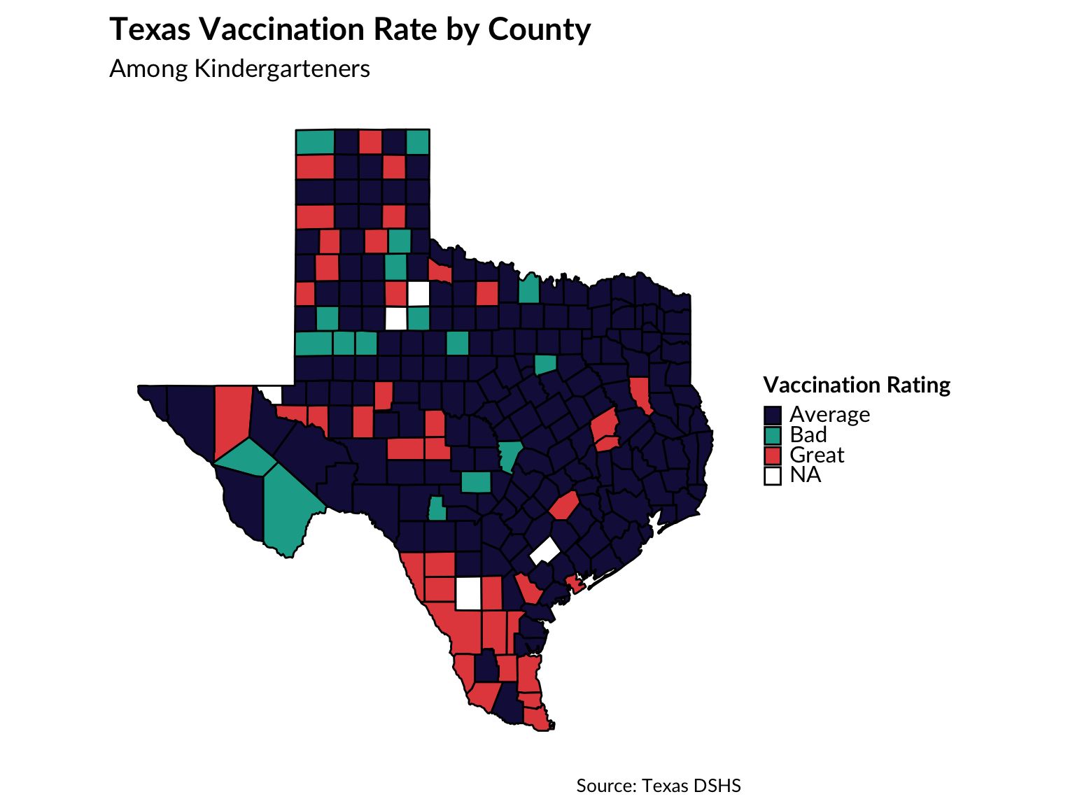
If the number of colors exceeds the number of colors in the TPL palette (9), the function tpl_color_pal() will drop the TPL color palette and return the greatest number of unique colors possible within the RColorBrewer’s “Paired” palette (for more information on the use of RColorBrewer palettes, see this chapter).
tx_vac %>%
  ggplot(mapping = aes(x = long, y = lat, group = group, fill = subregion)) +
  coord_fixed(1.3) +
  geom_polygon(color = "black", show.legend = FALSE) +
  labs(title = "Texas Counties")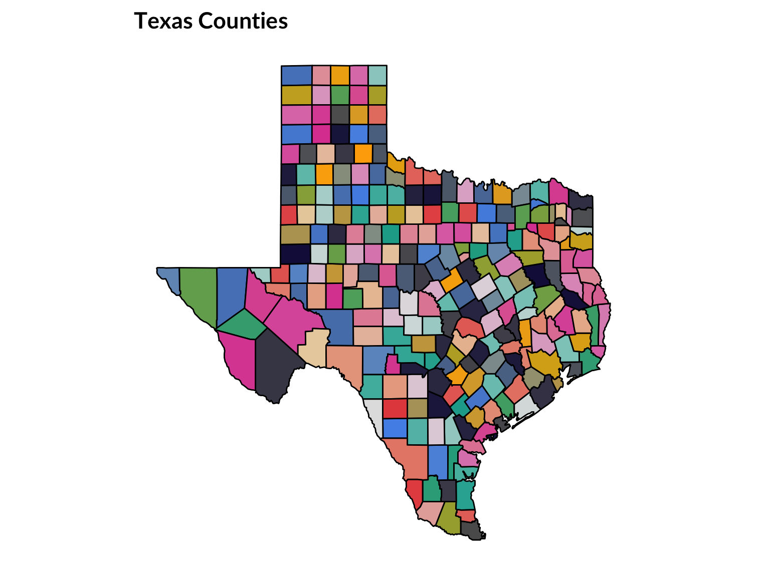
# default to print afterwards
set_tpl_theme(style = "print")
TPL Branding
Logo
The user also has the option to include the TPL logo in single plots. This may be preferred for those reports being made especially public, or to serve as a pseudo-watermark in proprietary plots.
The user can specify the position of the logo as well as its scale. The scale argument refers to the size of the logo object, with the specified number corresponding to a multiplication with the normal logo size. In other words, scale = 2 will double the size of the logo. The logo defaults to 1/7th of the size of the plot.
plot <- ggplot(iris, aes(x=Species, y=Sepal.Width, fill=Species)) +
    geom_bar(stat="summary", fun.y="mean", show.legend = FALSE) +
    scale_y_continuous(expand = expand_scale(mult = c(0, 0.001))) +
    labs(x="Species", y="Mean Sepal Width (cm)", fill="Species", title="Iris Dataset")

add_tpl_logo(plot, position = "top right", scale = 1.5)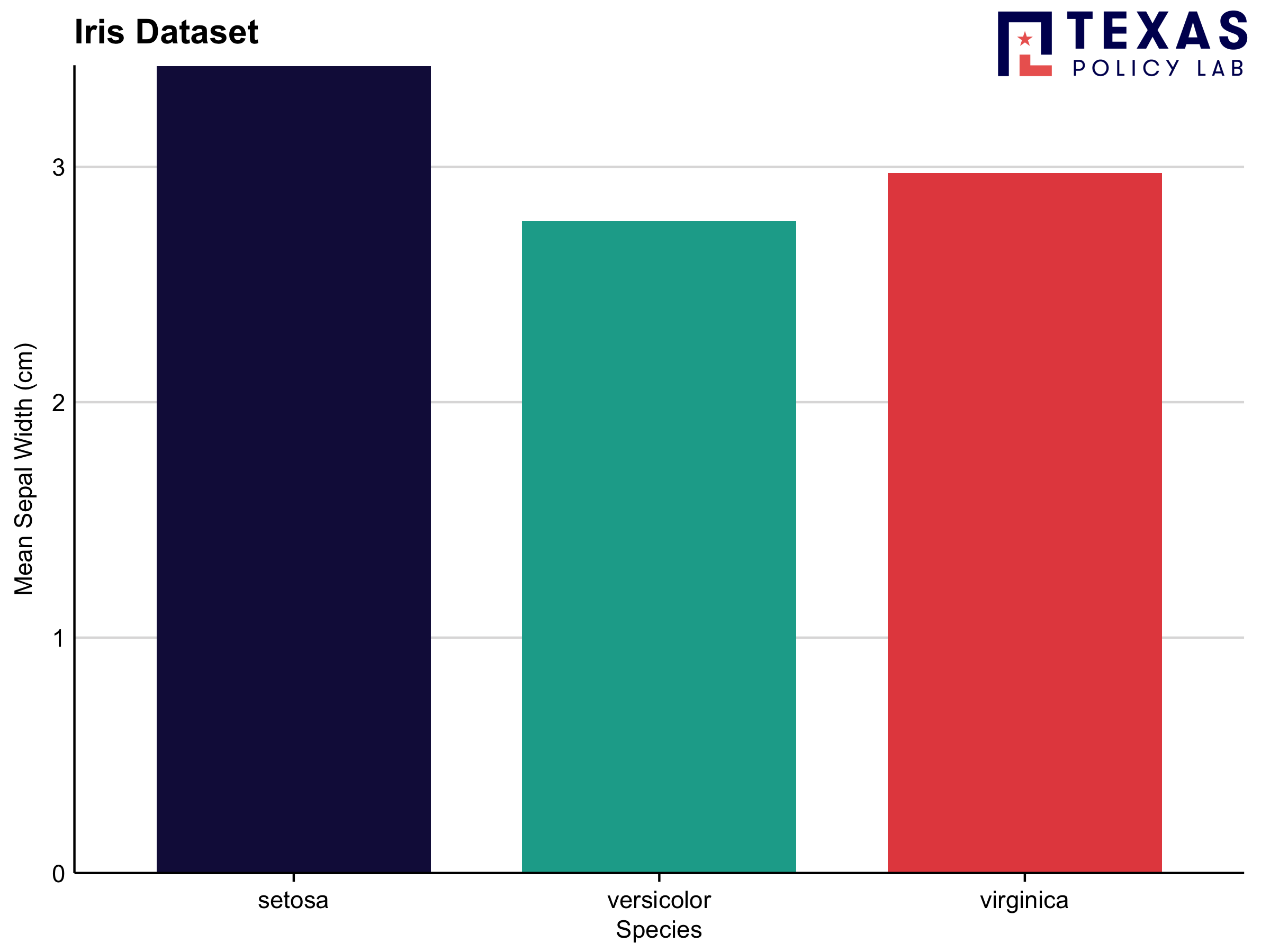
Logo Text
There may be some instances when an all-out logo is not warranted or preferred. If that is the case and the user would still like to watermark their figures, they can use the function add_tpl_logo_text() to add text to an existing plot object:
plot <- ggplot(iris, aes(x=jitter(Sepal.Width), y=jitter(Sepal.Length), col=Species, size = Petal.Length)) +
    geom_point() +
    labs(x="Sepal Width (cm)", y="Sepal Length (cm)", col="Species", size = "Petal Length", title="Iris Dataset")

add_tpl_logo_text(plot)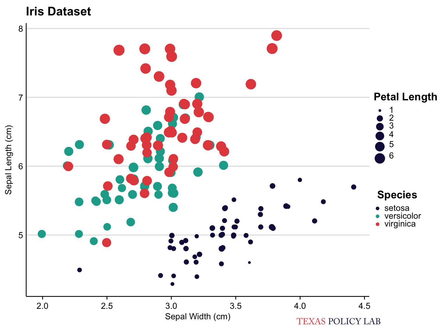
The user may also need to specify align, which moves the plot horizontally across the bottom of the page.
plot <- ggplot(iris, aes(x=Species, y=Sepal.Width, fill=Species)) +
    geom_boxplot(show.legend = FALSE) +
    labs(x="Species", y="Sepal Width (cm)", fill="Species", title="Iris Dataset", subtitle ="When specifying align = 1")

add_tpl_logo_text(plot, align = 1) 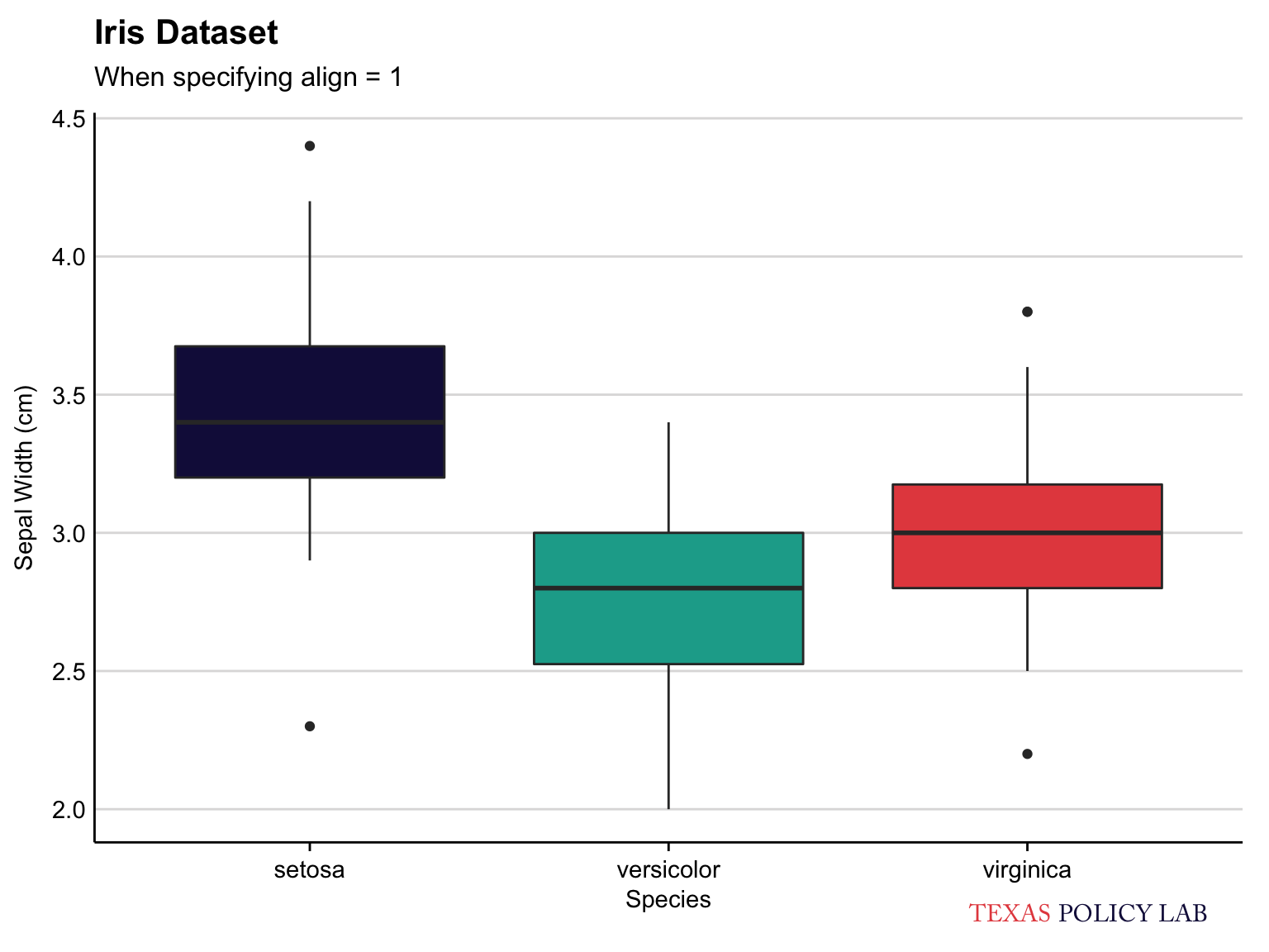
Additional Functions
Drop Axes
In the event that the user wishes to drop an axis, they may do so with drop_axis(). The function may drop any combination of axes depending on the user’s input (drop = "x", drop = "y", drop = "both", drop = "neither").
Unlike add_tpl_logo(), drop_axis() should be added to an existing plot object:
ggplot(iris, aes(x=jitter(Sepal.Width), y=jitter(Sepal.Length), col=Species, size = Petal.Length)) +
    geom_point() +
    labs(x="Sepal Width (cm)", y="Sepal Length (cm)", col="Species", size = "Petal Length", title="Iris Dataset") +
    drop_axis(axis = "y")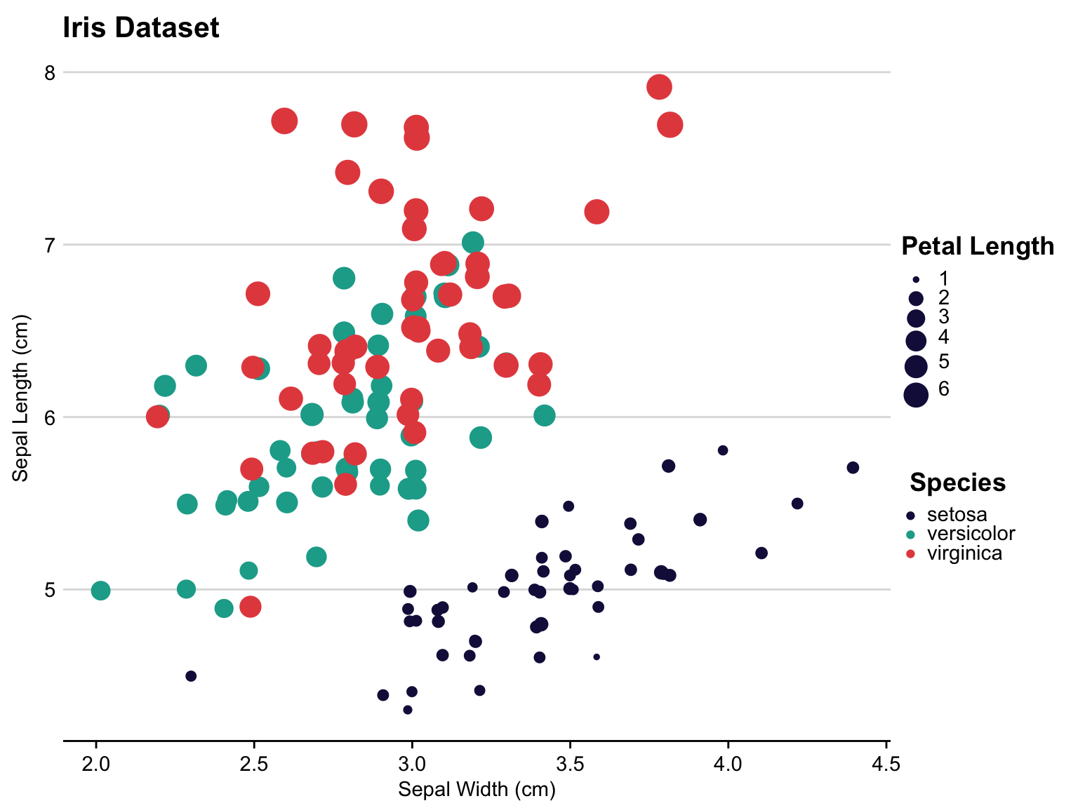
Colors
I also put a lot of time into creating a color palette which was both aesthetically pleasing and accessible to color-blind viewers. This was somewhat difficult because there are quite a few types of colorblindness. Thankfully, my boss is colorblind, making test cases a lot more accessible!
The function view_palette plots base color palettes included in tpltheme. All TPL color palettes are led by the notation
palette_tpl_* and therefore can be easily autocompleted within RStudio.
p1 <- view_palette(palette = palette_tpl_main) + ggtitle("Categorical")
p2 <- view_palette(palette = palette_tpl_diverging) + ggtitle("Diverging")
p3 <- view_palette(palette = palette_tpl_sequential) + ggtitle("Sequential")

gridExtra::grid.arrange(p1, p2, p3, nrow = 1)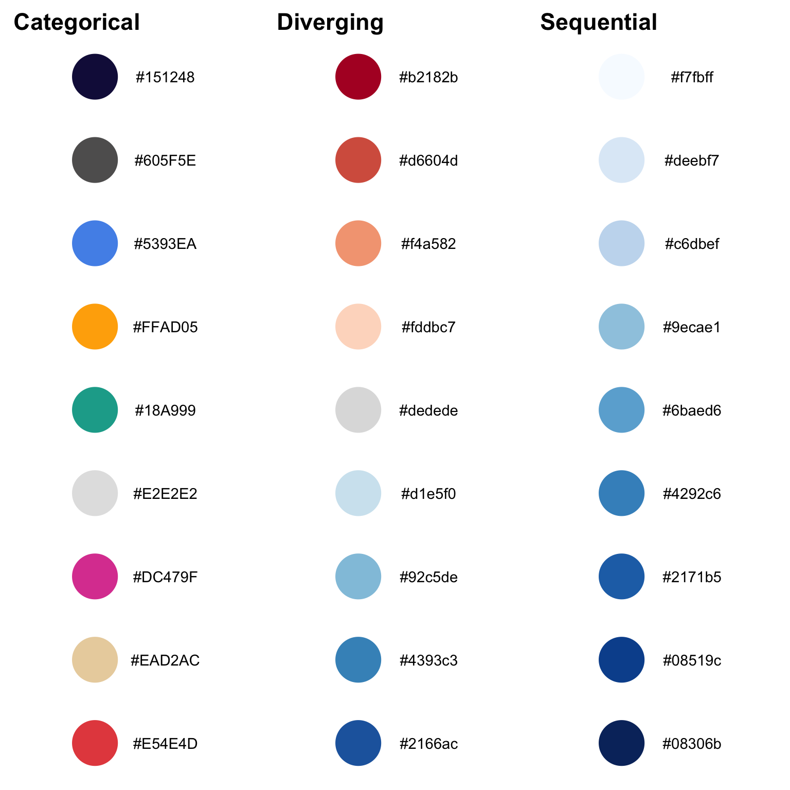
These palettes were created using http://colorbrewer2.org and http://coloors.co and are colorblind friendly.
The diverging and sequential color palettes are from http://colorbrewer2.org and the categorical palette is composed of a variety of colors from https://coolors.co/ and the TPL website.
In action, the color palette looks like this:
normal <- diamonds %>%
  group_by(clarity) %>%
  summarise(price = mean(price)) %>%
  mutate(clarity = forcats::fct_reorder(clarity, price)) %>%
  ggplot() +
  geom_col(aes(x = clarity, y = price, fill = clarity), show.legend = FALSE) +
  labs(title = "TPL Color Palette",
       subtitle = "in action",
       x = "Clarity",
       y = "Price",
       fill = element_blank()) +
  theme(axis.text.x = element_text(angle = 45, hjust = 1)) +
  coord_flip() +
  scale_fill_discrete() +
  scale_y_continuous(expand = expand_scale(mult = c(0, 0.001))) +
  drop_axis(axis = "x")

reversed <- normal +
  labs(subtitle = "(reversed)") +
  scale_fill_discrete(reverse = TRUE)

gridExtra::grid.arrange(normal, reversed)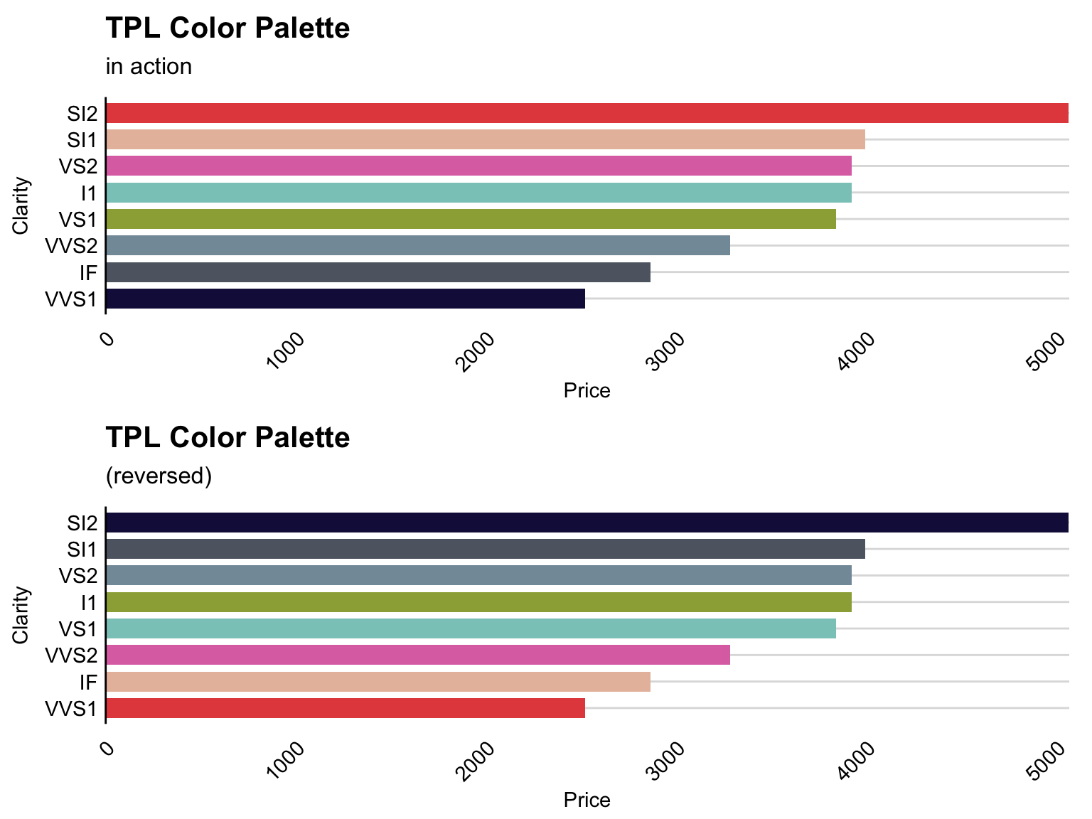
The user may specify the color palette in the scale_fill_* or scale_color_* functions in a ggplot call. Specifically, the user can specify the palette (categorical, diverging, sequential) and whether the palette should be reversed.
set_tpl_theme(style = "print", font = "lato")
normal <- ggplot(diamonds) +
  geom_bar(aes(x = cut, fill = clarity)) +
  labs(title = "TPL Color Palette",
       subtitle = "On sample data",
       x = "Cut",
       y = "Count",
       fill = "Clarity") +
  scale_y_continuous(expand = expand_scale(mult = c(0, 0.001))) +
  theme(axis.text.x = element_text(angle = 45, hjust = 1))

reversed <- normal +
  labs(subtitle = "(reversed)") +
  scale_fill_discrete(reverse = TRUE)

gridExtra::grid.arrange(normal, reversed, nrow = 1)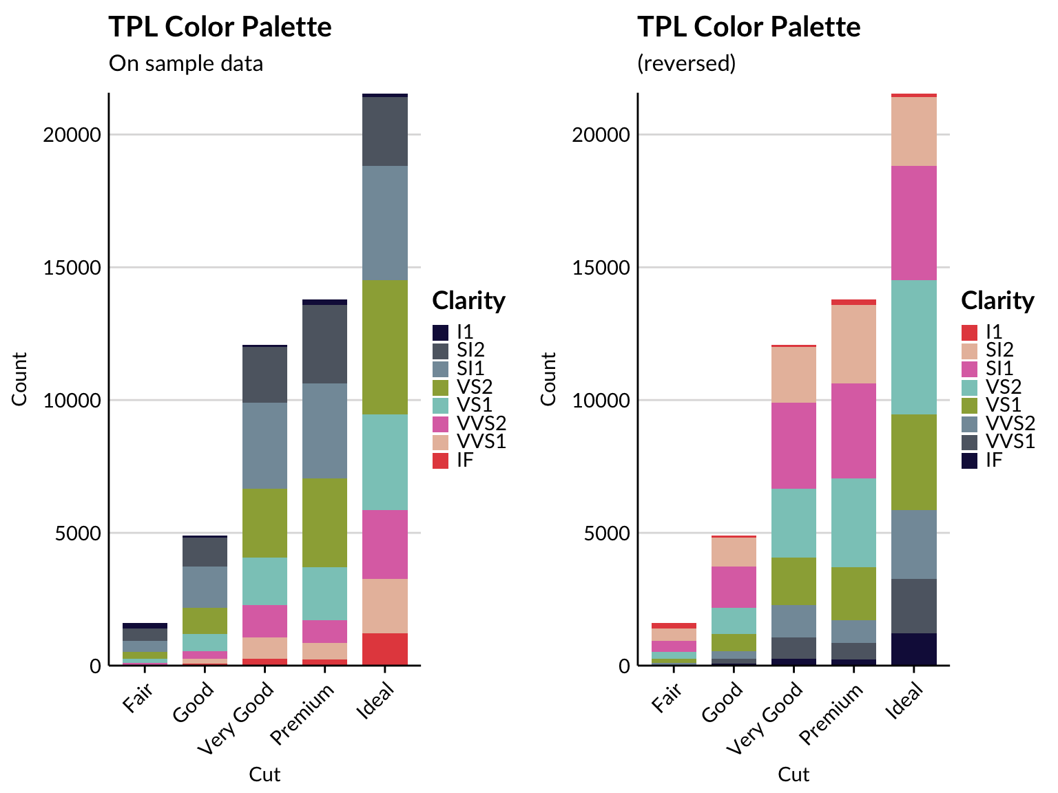
data <- gapminder::gapminder %>%
  dplyr::filter(gapminder::gapminder$country %in% c("France", "Germany", "Ireland", "Italy", "Japan", "Norway", "Mexico", "United States")) %>%
  dplyr::mutate(year = as.Date(paste(year, "-01-01", sep = "", format='%Y-%b-%d')))

ggplot(data = data, aes(x = year, y = gdpPercap, fill = country)) +
  geom_area(alpha = 0.8) +
  scale_x_date(expand = c(0,0)) +
  scale_y_continuous(expand = c(0, 0), labels = scales::dollar) +
  labs(title = "GDP Per Capita Over Time",
       subtitle = "Using the TPL Color Palette",
       x = element_blank(),
       y = "GDP Per Capita",
       fill = "Country") +
  theme(axis.text.x = element_text(angle = 45, hjust = 1))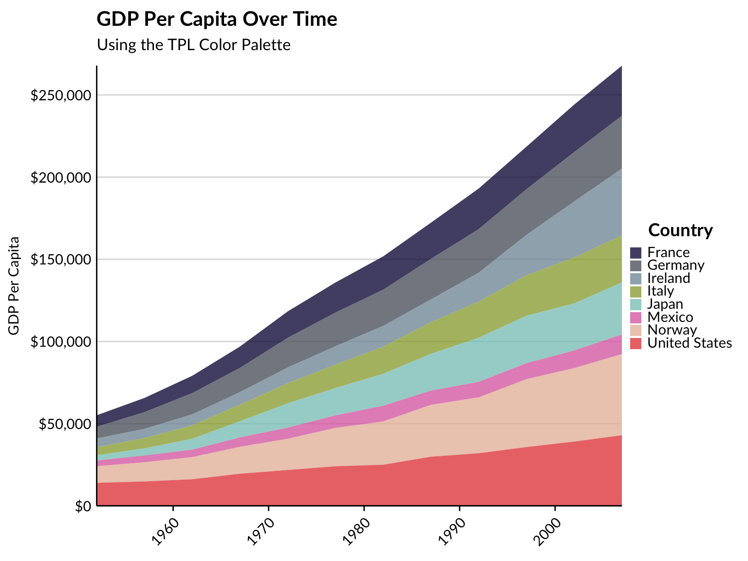
Restore Defaults
By calling undo_tpl_theme, you are able to remove TPL-specific theme settings and restores to ggplot defaults (but why would you want to do that?).
undo_tpl_theme()## [1] "All TPL defaults were removed and the tpltheme package has been effectively detached from the current environment. To restore TPL defaults, use set_tpl_theme()."ggplot(iris, aes(x=jitter(Sepal.Width), y=jitter(Sepal.Length), col=Species, size = Petal.Length)) +
geom_point() +
labs(x="Sepal Width (cm)", y="Sepal Length (cm)", col="Species", size = "Petal Length", title="Iris Dataset")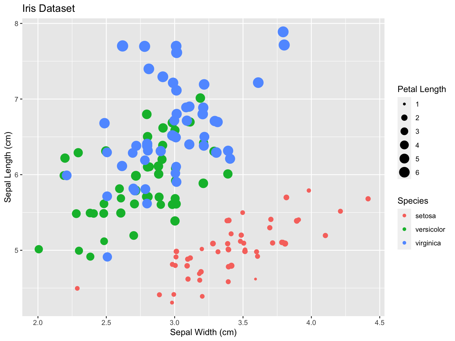
To restore the TPL theme, simply call set_tpl_theme():
set_tpl_theme()
last_plot()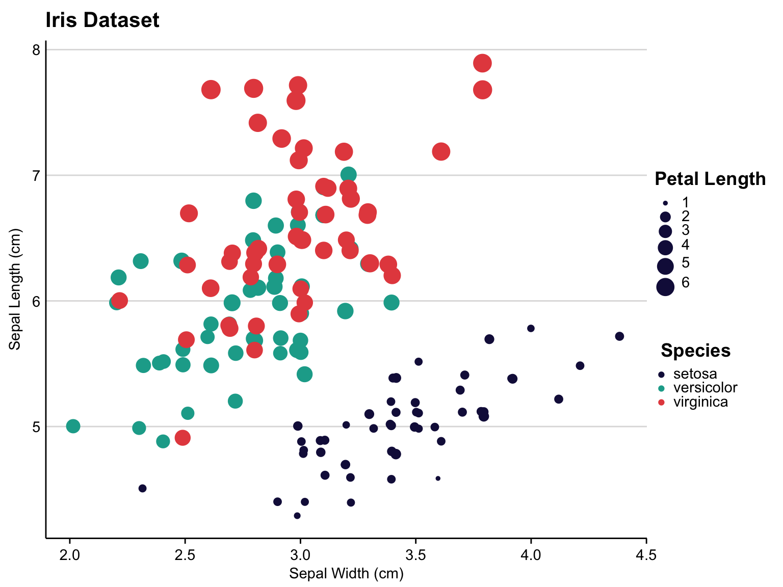
Connor Rothschild
Undergraduate at Rice University
I’m a senior at Rice University interested in public policy, data science and their intersection. I’m most passionate about translating complex data into informative and entertaining visualizations.