Mapping Police Killings
Visualizing officer-involved deaths since 2013.
Tools used
D3.js, Vue.js, Bulma, R
Published
December 2020
Audience
Mapping Police Violence
What it is
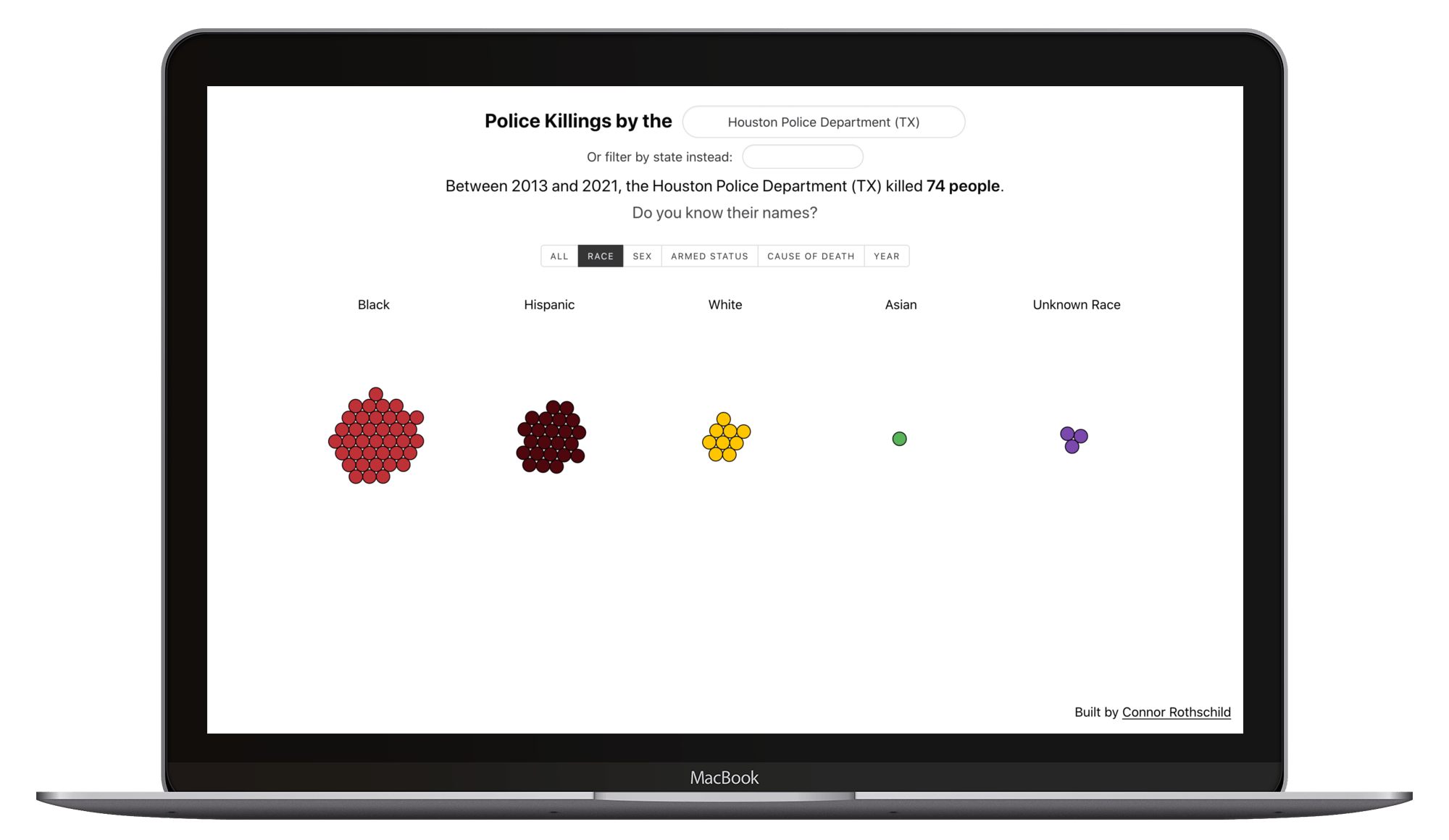
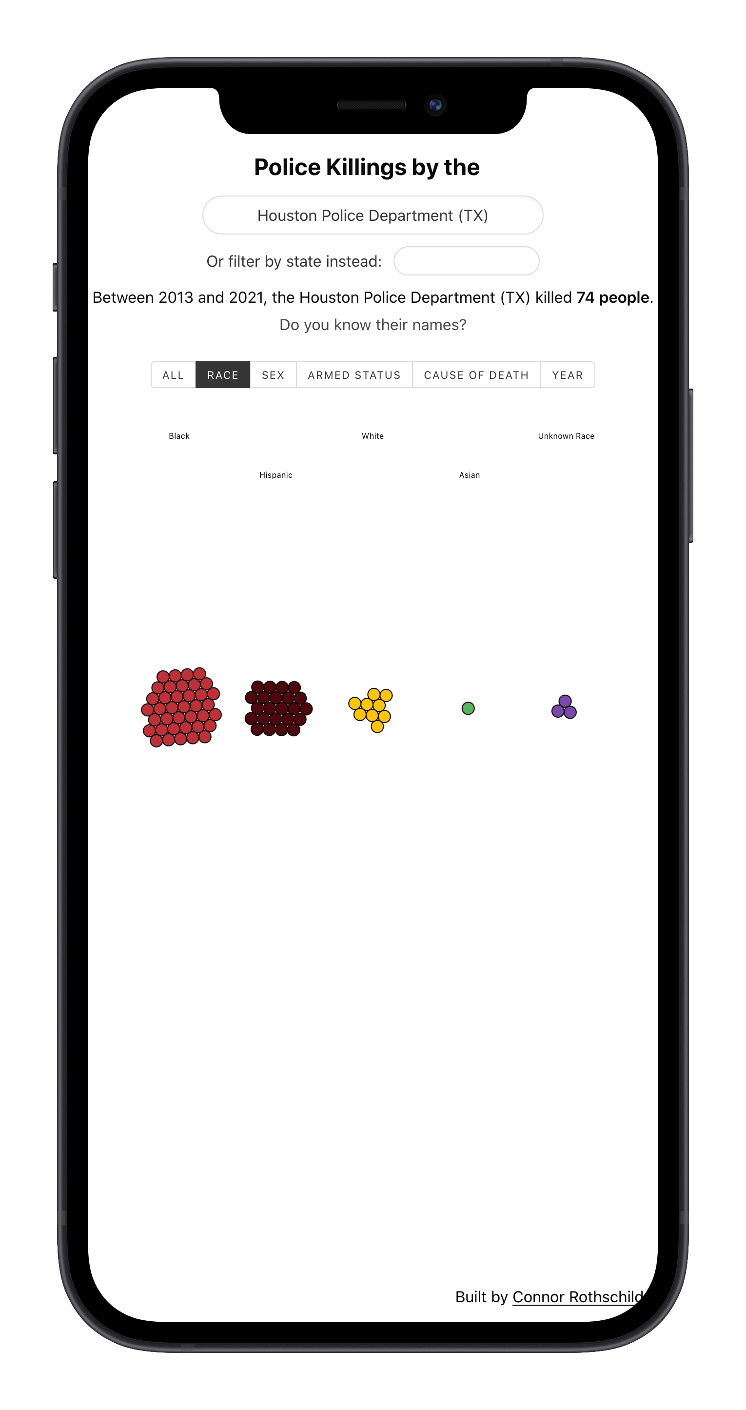
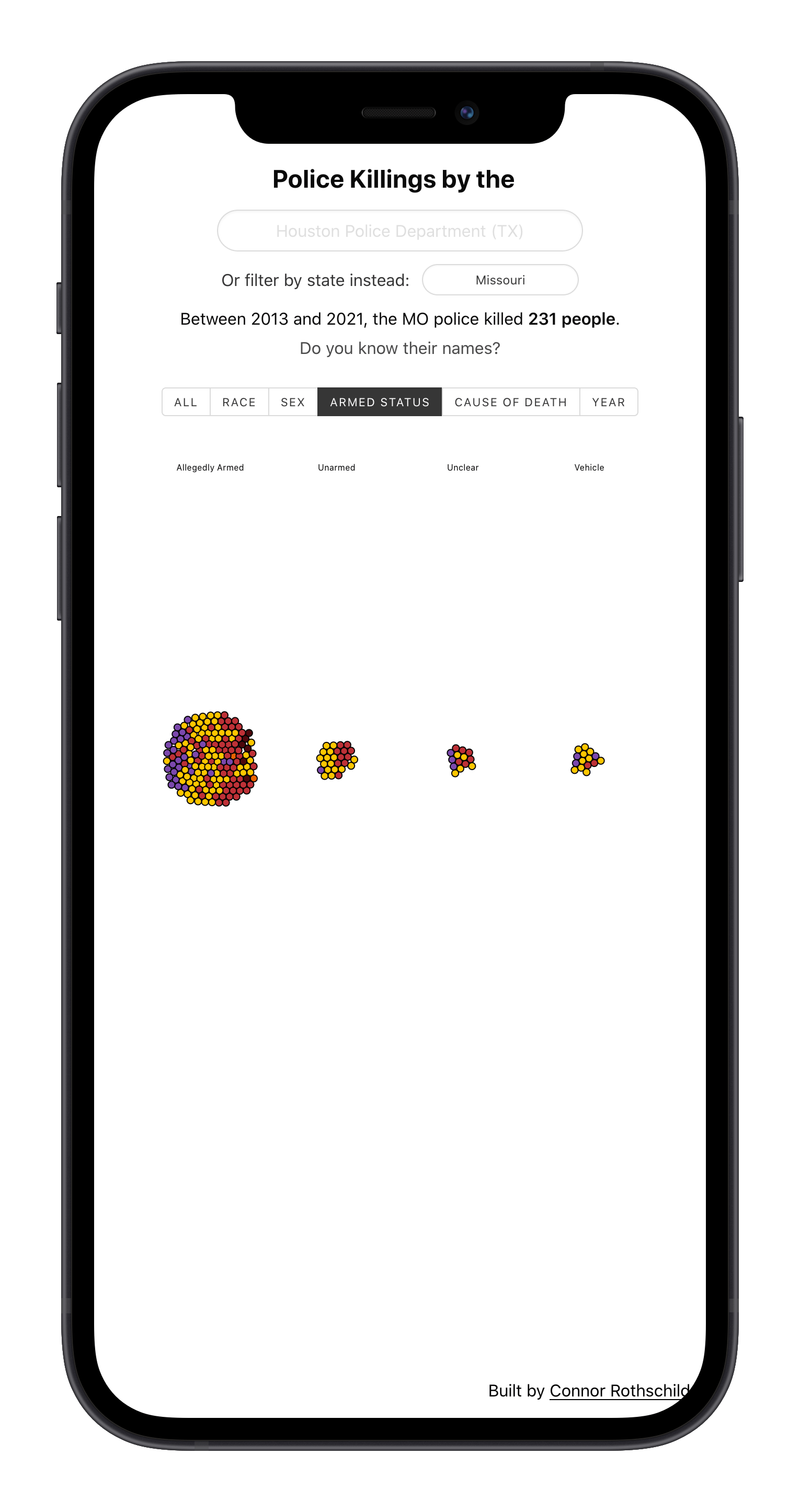
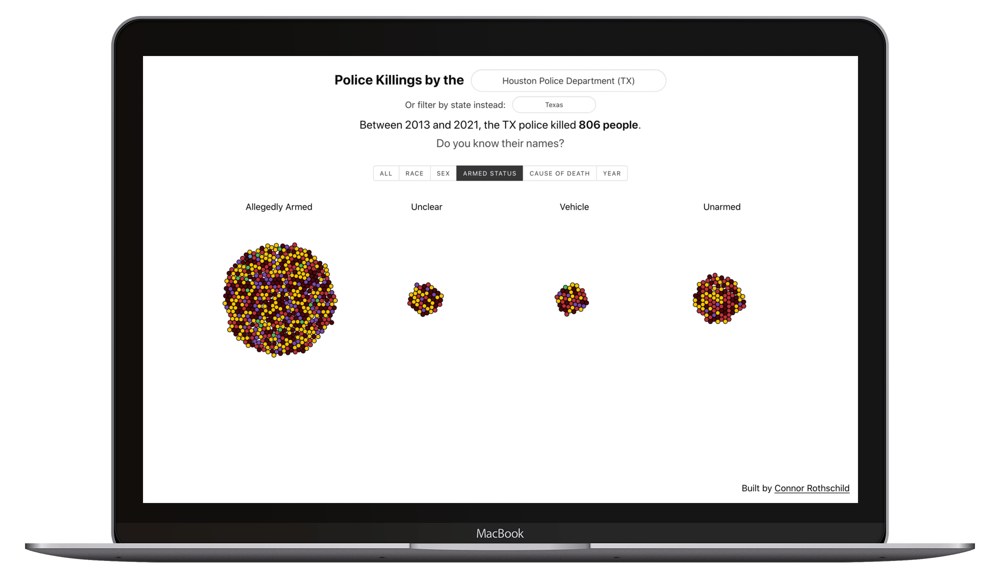
Mapping Police Killings is an application that allows for user exploration of officer-involved deaths across any US city or state. It leverages data from Mapping Police Violence and visualizes shootings in a geographic area using a force-directed graph built in D3. Users are able to filter by city or state, and upon initail selection, they are able to group by a variety of victim characteristics, such as age, race, armed status, or cause of death.
The application is featured on the Mapping Police Violence homepage. It is seen by thousands of visitors on a daily basis.
Tools used
I used Vue to design the application and handle user interaction. I used D3.js for visualization and for its force-directed diagram capabilities. Additional styling was done with Bulma.
This was actually the second iteration of this visualization. Version 1 can be found here. Although that version was built with vanilla JavaScript and no CSS library (everything was built from scratch!). Upon deploying this to a more serious and more visited site (Mapping Police Violence's homepage), I decided an upgrade would be worth the investment.
Project images