Games and Guns
Is there a connection between video games and gun violence, as Republicans suggest?
Load Packages
library(readr)
library(readxl)
library(tidyverse)
library(ggplot2)
library(showtext)
library(emojifont)
library(cr)
conflicted::conflict_prefer("filter", "dplyr")
conflicted::conflict_prefer("scale_colour_discrete", "cr")

set_cr_theme(font = "IBM Plex Sans")
Load Data
Data regarding gun deaths per capita comes from the Institute for Health Metrics and Evaluation
guns <- read_csv("data/IHME-guns.csv")

guns <- guns %>% select(Location, Value)
Data regarding video game sales per capita comes from this Google Spreadsheet which was pulled from NewZoo, a gaming analytics company.
games <- read_excel("data/GameRevenueByCountry.xlsx")

games <- games %>%
  rename(revenue = `PER CAPITA REVENUE`) %>%
  select(Country, revenue)
Merge and Clean Data
joined <- left_join(games, guns, by = c("Country" = "Location"))Next, we clean games dataset so that Country matches the Location column from guns.
games <- games %>%
  mutate(Country = case_when(Country == "Republic of Korea" ~ "South Korea",
                             Country == "Brunei Darussalam" ~ "Brunei",
                             #Country == "Macao" ~ ,
                             #Country == "Hong Kong, China" ~ ,
                             Country == "Lucembourg" ~ "Luxembourg",
                             Country == "Kuwair" ~ "Kuwait",
                             Country == "UAE" ~ "United Arab Emirates",
                             Country == "TFYR Macedonia" ~ "Macedonia",
                             Country == "Joran" ~ "Jordan",
                             Country == "Republic of Moldova" ~ "Moldova",
                             TRUE ~ as.character(Country)))
joined <- left_join(games, guns, by = c("Country" = "Location"))There are 98 countries with full data present.
We should also create a dummy variable for each country depending on whether it is an OECD country or not.
Country <- c(
"Austria",
"Belgium",
"Canada",
"Denmark",
"France",
"Greece",
"Iceland",
"Ireland",
"Italy",
"Luxembourg",
"Netherlands",
"Norway",
"Portugal",
"Spain",
"Sweden",
"Switzerland",
"Turkey",
"United Kingdom",
"United States",
"West Germany",
"Australia",
"Finland",
"Japan",
"New Zealand")

OECD <- "OECD"

oecd <- data.frame(Country, OECD)
oecd_joined <- left_join(joined, oecd, by = "Country")
oecd_joined <- oecd_joined %>%
mutate(OECD = ifelse(is.na(OECD), "Not OECD", "OECD"))Visualize
This allows us to plot each country in a scatterplot, with point colour corresponding to OECD status:
oecd_joined %>%
  ggplot(aes(x = revenue, y = Value, colour = factor(OECD))) +
  geom_point() +
  geom_text(aes(label = ifelse(Country == "United States", as.character(Country),''), vjust = -1), show.legend = FALSE) +
  geom_text(aes(label = ifelse(Value > 40, as.character(Country),''), vjust = -1), show.legend = FALSE) +
  geom_text(aes(label = ifelse(revenue > 150, as.character(Country),''), vjust = -1), show.legend = FALSE) +
  labs(x = "Video Game Revenue per Capita (US $)",
       y = "Violent Gun Deaths per 100k",
       title = "Gun Deaths vs Game Sales",
       colour = element_blank(),
       caption = "\nSources: Institute for Health Metrics and Evaluation, NewZoo") +
  scale_y_continuous(limits = c(0, 45)) +
  theme(plot.caption = element_text(face = "italic", hjust = 0),
        legend.position = "top", legend.direction = "horizontal") +
  drop_axis(axis = "y")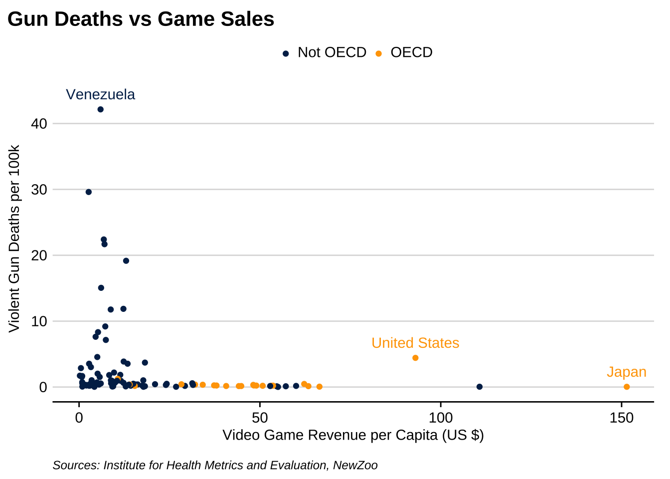
Finally, we can focus on only OECD countries:
oecd_joined %>%
  dplyr::filter(OECD == "OECD") %>%
  ggplot(aes(x = revenue, y = Value)) +
  geom_point() +
  #geom_smooth() +
  geom_text(aes(label = ifelse(Country == "United States", as.character(Country),''), vjust = -1)) +
  labs(x = "Video Game Revenue per Capita (US $)",
       y = "Violent Gun Deaths per 100k",
       title = "Gun Deaths vs Game Sales",
       subtitle = "OECD Countries",
       caption = "\nSources: Institute for Health Metrics and Evaluation, NewZoo") +
  scale_y_continuous(limits = c(0, 5)) +
  theme(plot.caption = element_text(face = "italic", hjust = 0)) +
  drop_axis(axis = "y")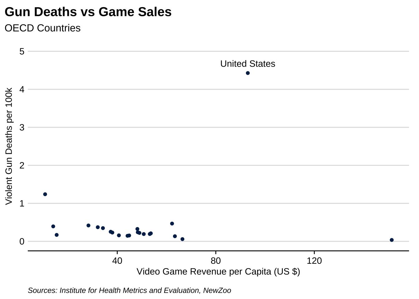
To conclude, let’s add an emoji to fully capture our skepticism with the newfound argument linking video games to violence.
oecd_joined %>%
  dplyr::filter(OECD == "OECD") %>%
  ggplot(aes(x = revenue, y = Value)) +
  geom_point() +
  #geom_smooth() +
  geom_text(aes(label = ifelse(Country == "United States", as.character(Country),''), vjust = -1)) +
  labs(x = "Video Game Revenue per Capita (US $)",
       y = "Violent Gun Deaths per 100k",
       title = "Gun Deaths vs Game Sales",
       subtitle = "OECD Countries",
       caption = "\nSources: Institute for Health Metrics and Evaluation, NewZoo") +
  scale_y_continuous(limits = c(0, 5)) +
  theme(plot.caption = element_text(face = "italic", hjust = 0)) +
  drop_axis(axis = "y") +
  geom_text(y = 4.85, x = 107.5, size = 7, label = emoji('thinking'), family = "EmojiOne")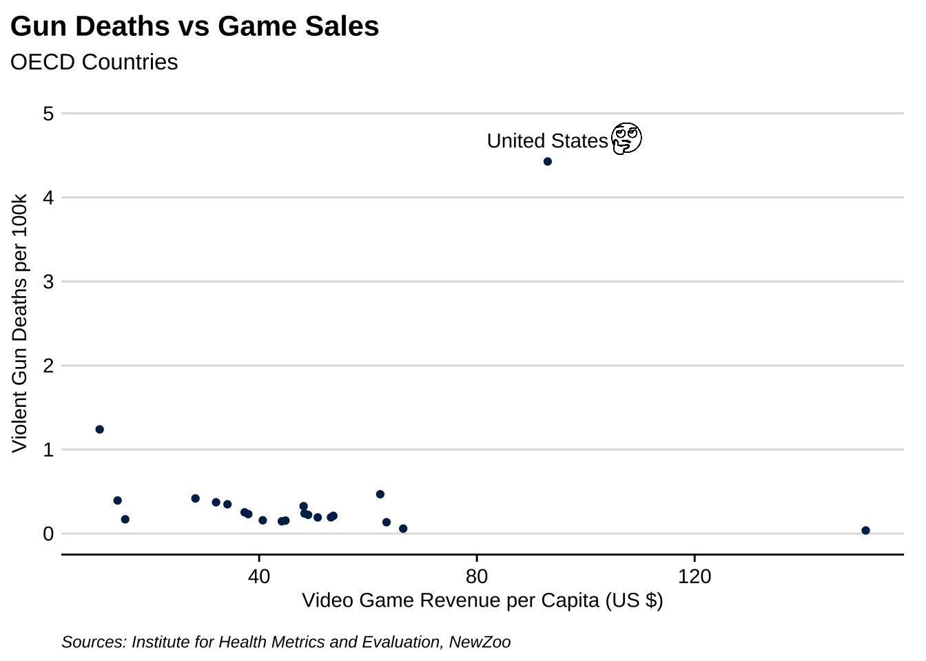
Connor Rothschild
Undergraduate at Rice University
I’m a senior at Rice University interested in public policy, data science and their intersection. I’m most passionate about translating complex data into informative and entertaining visualizations.