Announcing the Nuxt Blog Starter
A minimal, content-focused blog site built with NuxtJS and Bulma.
February 2021 • 7 minute read
I'm happy to share a new starter template for minimal, content-focused blogs using NuxtJS and Bulma for styling. The site is a more simplified version of my own site.
Why Nuxt?
I've went through my fair share of blogs. See version 1 and version 2. I moved to a site using Nuxt for three reasons:
1. Speed and user experience
Nuxt is fast by default. It uses server-side rendering, rather than client-side rendering, which means that content is rendered before users visit your site. As explained on the Nuxt Blog:
nuxt generatewithtarget: 'static'will pre-render all your pages to HTML and save a payload file in order to mockasyncDataandfetchon client-side navigation, this means no more HTTP calls to your API on client-side navigation. By extracting the page payload to a js file, it also reduces the HTML size served as well as preloading it (from the in the header) for optimal performance.
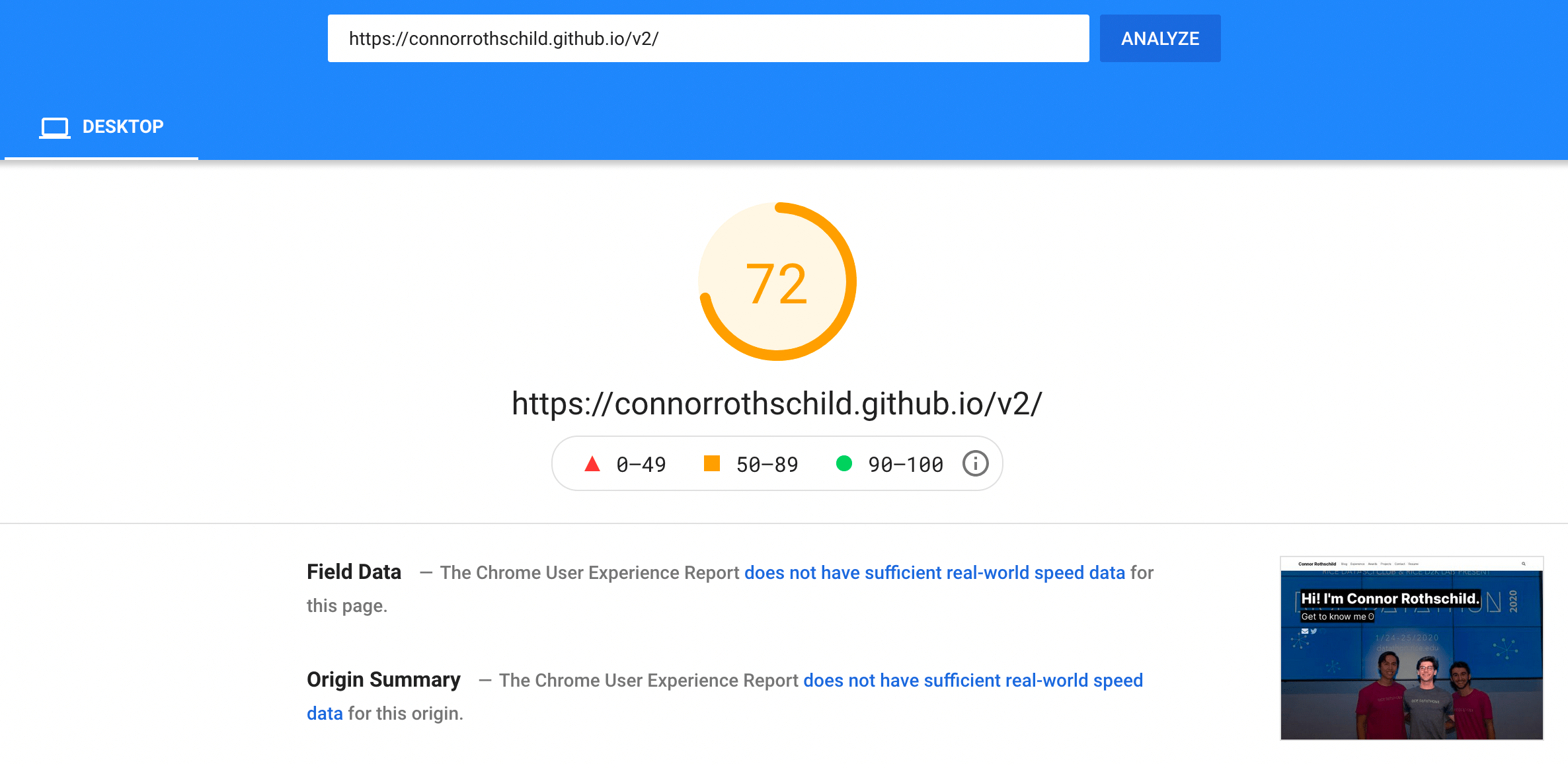
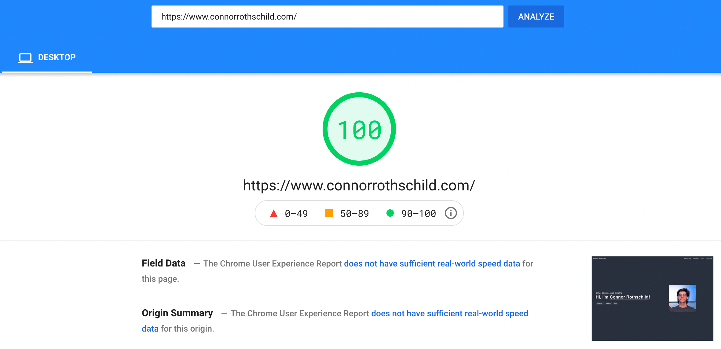
You can see the impact of SSR on performance by comparing my last blog iteration to this one.
The former, built using R blogdown and Hugo Academic, scored 72/100 on desktop performance, compared to a 100/100 on this version:
2. Flexibility and power
Too often, making 'fast' websites comes at the cost of flexibility and power. For example, the first version of my website was based on a Jekyll theme that was pretty, functional, and fast, but limited in its flexibility. That is, I was locked into the default appearance of the site, unless I wanted to really get into the weeds editing CSS and writing my own HTML markup. (At that point, I might as well had started a new blog or find another theme!)
I built this template because it is as performant as my V1 site (both receive over 95/100 on PageSpeed Insights), but with much more flexibility. In my experience, modifying the appearance of this site—whether thats through its constituent components in the components/ folder, or globally in the assets/scss/colors.scss file—is seamless while also allowing greater power than modifying the defaults in other, simpler blog templates.
Moreover, this kind of flexibility scales up with your knowledge of Vue and Nuxt. If you are already familiar with the technologies, this template should be ready for total transformation through whatever modifications you find necessary. Otherwise, all you need to do is follow the simple instructions in the template's README. To test this, I've helped a non-technical friend build out his own website from this theme, and seen firsthand how intuitive getting started can really be.
3. Learning new tech
A final reason to make this jump is to get familiar with JavaScript, Vue, Nuxt, and CSS. Many of my readers come from a visualization-centric background, and are most proficient in R. (Awesome!) I learned Vue (and then Nuxt) from scratch, by building a few projects and subsequently, my personal website!
Learning new tech never hurts. You will almost never regret spending a few hours to have a basic handle of a new language or tool. Get started with this template, see how it feels, and see if you like it! (If not, ditch the site! I won't be offended.)
Why this template specifically?
I didn't invent Nuxt, nor the portfolio site. There are a few other options for powerful, pretty starter templates using NuxtJS. In particular, I like Marina Aisa's and Daniel Kelly's.
That being said, I think my site is pretty cool. In creating the template, I've aimed for a mix of out-of-the-box features that "just work", with the ability to customize as necessary. I want to allow new users, who have little to no experience with web development, to create a blog, and allow advanced users, who probably know this stuff better than me, to get started with a powerful and customizable template.
There are a few features I think make this starter template unique:
Easy theming
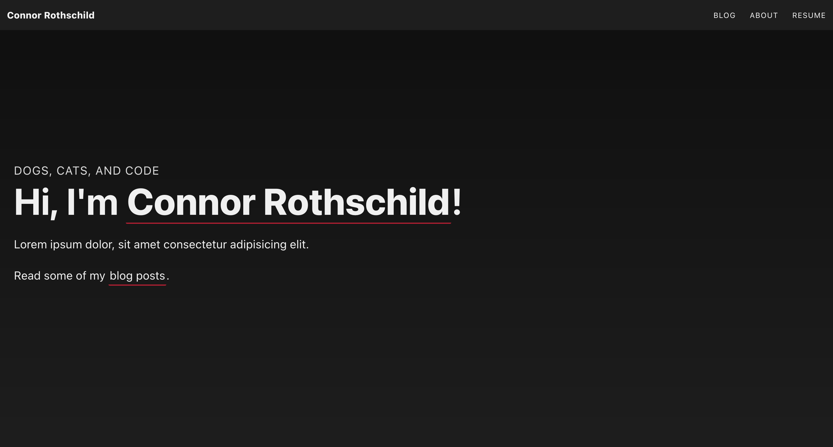
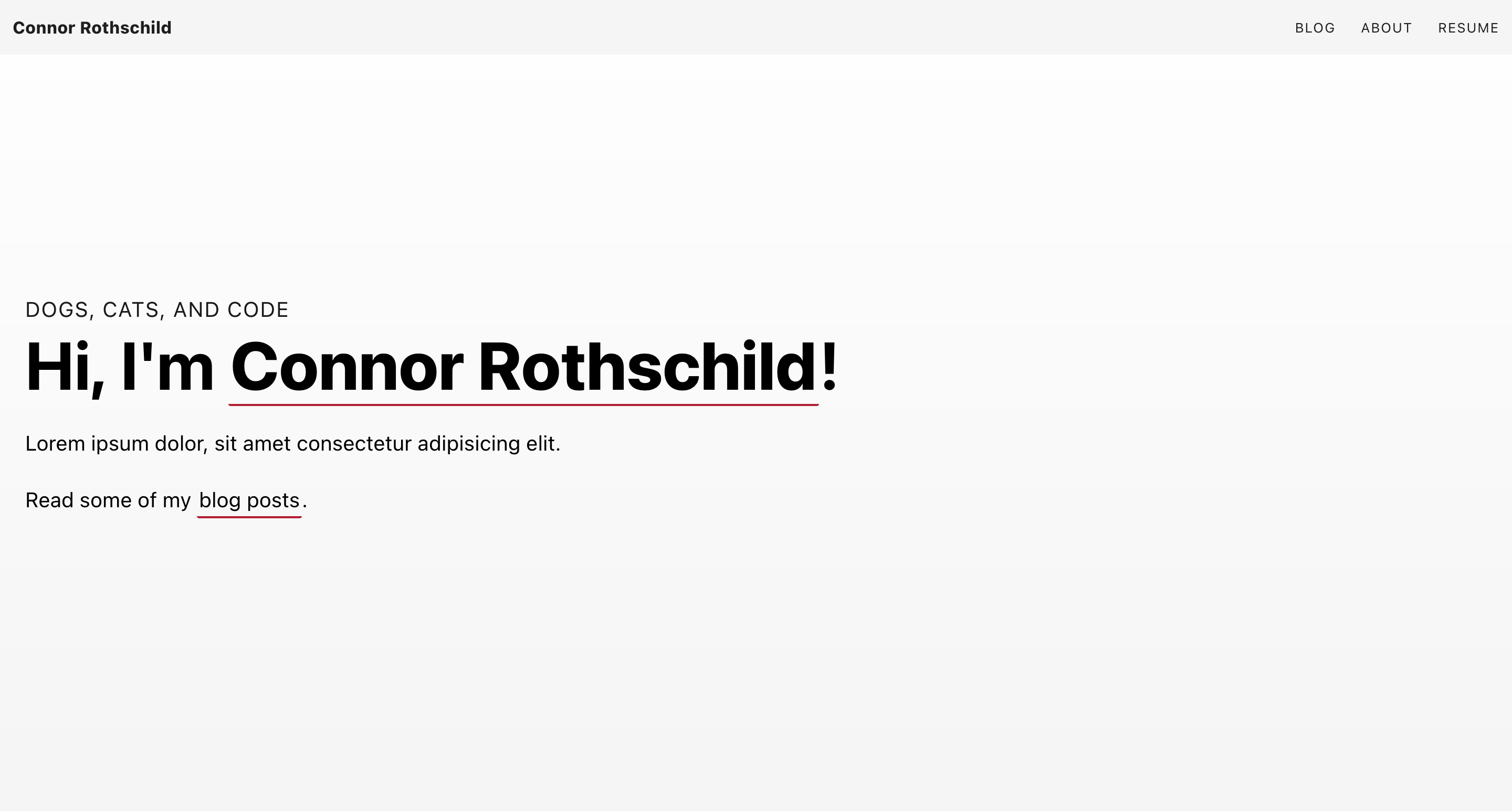
The site relies on three colors: a primary (background), secondary (accent), and a primary-invert (text). These are all defined in Sass variables that live in assets/scss/colors.scss. To change the appearance of your site, simply modify the colors you'd like to see as your background ($primary), your text ($text), and your accent ($secondary). Obviously, make sure your $primary and $text colors have sufficient contrast.
Dark mode/light mode
An example of this can be seen below the Sass defaults that live within assets/scss/colors.scss. Simply uncomment those lines (preceded by the comment "LIGHT MODE") to see your site with light mode defaults.
Dope transitions
Nuxt makes transitions easy. This template expands upon Nuxt's powerful page transitions by using Greensock's GSAP. In particular, I define elements that should fade in nicely for each page, like this:
transition: {
    mode: 'out-in',
    css: false,
    enter () {
        TweenMax.fromTo(".title", {x: "10%"}, {x: "0%" , duration: 0.1});
        TweenMax.fromTo(".subtitle, .card, .img",
                            {x: "10%", autoAlpha: 0},
                            {x: "0%", autoAlpha: 1, delay: 0.25, duration: 0.5, ease: Power3.easeOut}
                        );
    },
},
This creates some subtle yet attractive page transitions:
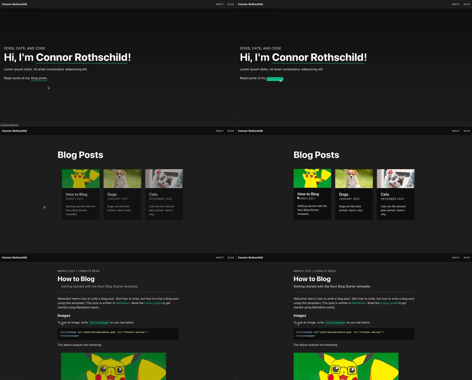
You can modify these transitions by adding and removing elements in the CSS selector parameters for each page's enter() property.
Meta tags/SEO
The function getSiteMeta(), found in the utils/ folder, allows for different meta tags for each page and for each blog post. The function allows the Twitter Cards for my home page and for a blog post to look different, like this:


The site is set up so that your cards will appear this way automatically! All you will have to do is edit utils/getSiteMeta.js with your specific information. Page-specific meta tags are also helpful for search engine optimization; your site might attract a larger number of visitors if it covers a wider variety of keywords.
Blog features
This site comes with all the same blog capabilities as a normal site, such as syntax highlighting, images, HTML support, and Vue components. Read this post if you're curious about features.
You can also include a few custom components I've made:
Info boxes
InfoBox.vue is a component that allows you to put notes/warnings/messages in your blog posts. Feel free to edit the component to adjust its styling.
Info boxes look like this!
Images
InlineImage.vue optimizes and handles the messy parts of images.
In specific, it:
- Allows for fullscreen, gallery views via
v-img. - Optimizes images with
nuxt-optimized-images.
Videos
ResponsiveVideo.vue takes a YouTube url (or otherwise embeddable video link) and makes it responsive.
You can see all of these components in action in the sample blog post.
Get started
Get started! Fork the repository here and follow instructions in the README to get started. Please reach out with any questions, either through filing an issue or via email.