TidyTuesday: Powerlifting
library(ggplot2)
library(tidyverse)
library(ggtext)
library(gifski)
library(gganimate)
library(cr)
#
set_cr_theme(font = "IBM Plex Sans")
# theme_set(theme_minimal())
Load and Clean Data
First, read in the data from https://openpowerlifting.org/data:
# df <- readr::read_csv("openpowerlifting-2019-09-20.csv")
#
# df_clean <- df %>%
#   janitor::clean_names()
#
# ipf_lifts <- df_clean %>%
#   select(name:weight_class_kg, starts_with("best"), place, date, federation, meet_name)  %>%
#   filter(!is.na(date)) %>%
#   filter(federation == "IPF")

ipf_lifts <- readr::read_csv("data/ipf_lifts.csv")
Clean ipf_lifts, and reshape the three lifts into one column:
ipf_lifts <- ipf_lifts %>%
  mutate(year = lubridate::year(date))

ipf_lifts_reshape <- ipf_lifts %>%
  tidyr::pivot_longer(cols = c("best3squat_kg", "best3bench_kg", "best3deadlift_kg"), names_to = "lift") %>%
  select(name, sex, year, lift, value)
For my visualization, I’m only concerned with the heaviest lifts from each year:
ipf_lifts_maxes <- ipf_lifts_reshape %>%
  group_by(year, sex, lift) %>%
  top_n(1, value) %>%
  ungroup %>%
  distinct(year, lift, value, .keep_all = TRUE)
In order to construct a dumbbell plot, we need both male and female observations in the same row.
max_pivot <- ipf_lifts_maxes %>%
  spread(sex, value)
Let’s try to construct a dataframe for each sex:
male_lifts <- max_pivot %>%
  select(-name) %>%
  filter(!is.na(M)) %>%
  group_by(year, lift) %>%
  summarise(male = mean(M))

female_lifts <- max_pivot %>%
  select(-name) %>%
  filter(!is.na(`F`)) %>%
  group_by(year, lift) %>%
  summarise(female = mean(`F`))
And join them:
max_lifts <- merge(male_lifts, female_lifts)

max_lifts_final <- max_lifts %>%
  group_by(year, lift) %>%
  mutate(diff = male - female)
Visualize
Finally, we can construct the visualization.
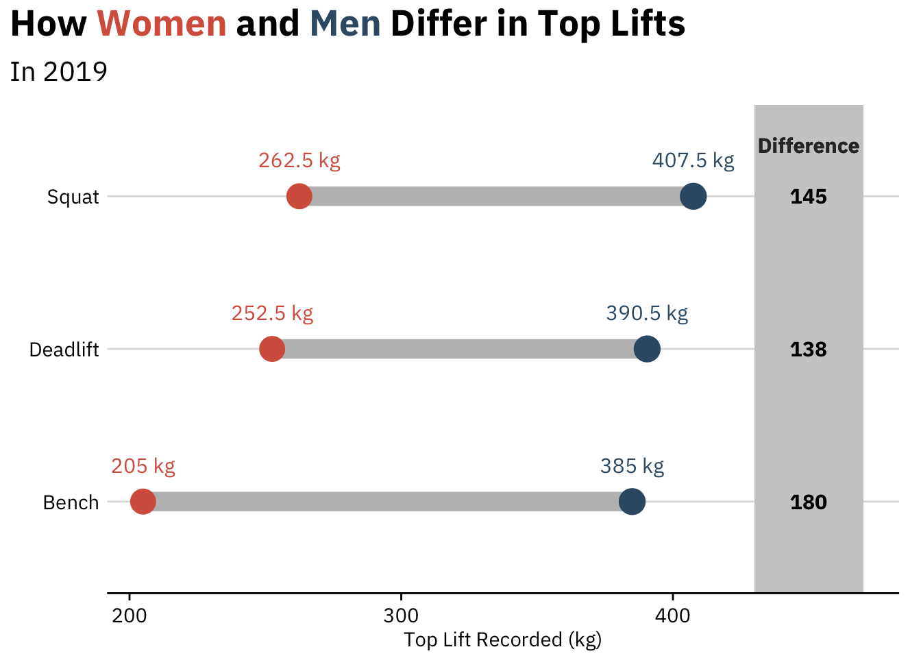
First, a static viz (thanks to hrbrmaster’s ggalt package):
max_lifts_final %>%
  filter(year == 2019) %>%
  ggplot() +
  ggalt::geom_dumbbell(aes(y = lift,
                    x = female, xend = male),
                colour = "grey", size = 5,
                colour_x = "#D6604C", colour_xend = "#395B74") +
  labs(y = element_blank(),
       x = "Top Lift Recorded (kg)",
       title =  "How <span style='color:#D6604C'>Women</span> and <span style='color:#395B74'>Men</span> Differ in Top Lifts",
                       subtitle = "In 2019") +
  theme(plot.title = element_markdown(lineheight = 1.1, size = 20),
        plot.subtitle = element_text(size = 15)) +
  scale_y_discrete(labels = c("Bench", "Deadlift", "Squat")) +
  drop_axis(axis = "y") +
  geom_text(aes(x = female, y = lift, label = paste(female, "kg")),
            color = "#D6604C", size = 4, vjust = -2) +
  geom_text(aes(x = male, y = lift, label = paste(male, "kg")),
            color = "#395B74", size = 4, vjust = -2) +
  geom_rect(aes(xmin=430, xmax=470, ymin=-Inf, ymax=Inf), fill="grey80") +
  geom_text(aes(label=diff, y=lift, x=450), fontface="bold", size=4) +
  geom_text(aes(x=450, y=3, label="Difference"),
            color="grey20", size=4, vjust=-3, fontface="bold")
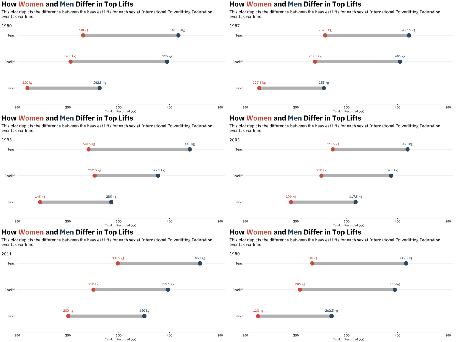
Finally, we animate, using Thomas Pedersen’s wonderful gganimate package:
animation <- max_lifts_final %>%
  ggplot() +
  ggalt::geom_dumbbell(aes(y = lift,
                    x = female, xend = male),
                colour = "grey", size = 5,
                colour_x = "#D6604C", colour_xend = "#395B74") +
  labs(y = element_blank(),
       x = "Top Lift Recorded (kg)",
       title =  "How <span style='color:#D6604C'>Women</span> and <span style='color:#395B74'>Men</span> Differ in Top Lifts",
  subtitle='\nThis plot depicts the difference between the heaviest lifts for each sex at International Powerlifting Federation\nevents over time. \n \n{closest_state}') +
  theme(plot.title = element_markdown(lineheight = 1.1, size = 25, margin=margin(0,0,0,0)),
        plot.subtitle = element_text(size = 15, margin=margin(8,0,-30,0))) +
  scale_y_discrete(labels = c("Bench", "Deadlift", "Squat")) +
  drop_axis(axis = "y") +
  geom_text(aes(x = female, y = lift, label = paste(female, "kg")),
            color = "#D6604C", size = 4, vjust = -2) +
  geom_text(aes(x = male, y = lift, label = paste(male, "kg")),
            color = "#395B74", size = 4, vjust = -2) +
  transition_states(year, transition_length = 4, state_length = 1) +
  ease_aes('cubic-in-out')

a_gif <- animate(animation,
                 fps = 10,
                 duration = 25,
                 width = 800, height = 400,
                 renderer = gifski_renderer("outputs/animation.gif"))

a_gif
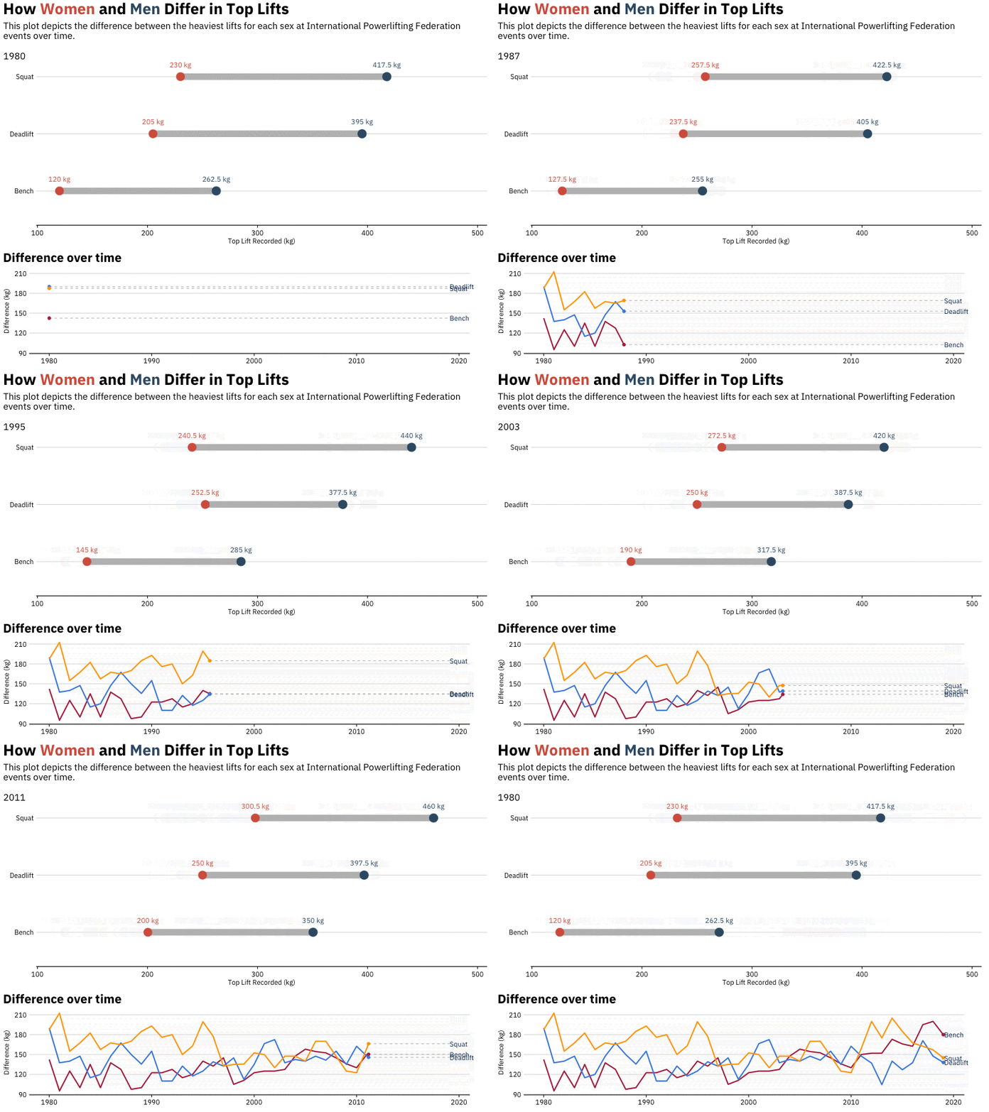
I’d like to include another GIF: a line chart of differences over time
animation2 <- max_lifts_final %>%
  ungroup %>%
  mutate(lift = case_when(lift == "best3bench_kg" ~ "Bench",
                          lift == "best3squat_kg" ~ "Squat",
                          lift == "best3deadlift_kg" ~ "Deadlift")) %>%
  ggplot(aes(year, diff, group = lift, color = lift)) +
  geom_line(show.legend = FALSE) +
  geom_segment(aes(xend = 2019.1, yend = diff), linetype = 2, colour = 'grey', show.legend = FALSE) +
  geom_point(size = 2, show.legend = FALSE) +
  geom_text(aes(x = 2019.1, label = lift, color = "#000000"), hjust = 0, show.legend = FALSE) +
  drop_axis(axis = "y") +
  transition_reveal(year) +
  coord_cartesian(clip = 'off') +
  theme(plot.title = element_text(size = 20)) +
  labs(title = 'Difference over time',
       y = 'Difference (kg)',
       x = element_blank()) +
  theme(plot.margin = margin(5.5, 40, 5.5, 5.5))

b_gif <- animate(animation2,
                 fps = 10,
                 duration = 25,
        width = 800, height = 200,
        renderer = gifski_renderer("outputs/animation2.gif"))

b_gif
Next, combine them using magick (thanks to this post):
library(magick)
a_mgif <- image_read(a_gif)
b_mgif <- image_read(b_gif)

new_gif <- image_append(c(a_mgif[1], b_mgif[1]), stack = TRUE)
for(i in 2:250){
  combined <- image_append(c(a_mgif[i], b_mgif[i]), stack = TRUE)
  new_gif <- c(new_gif, combined)
}

new_gif